The Star Trek Enterprise is one of my favorite Mego toys. There's precious little I can add to the fantastic analysis and commentary of Kevin (MirrorSpock) in the Mego Museum Star Trek Gallery. As I spent hours upon hours rebuilding the Mego Museum Library I did stumble across some very interesting pictures I want to share that I think give insights into the development of this set.
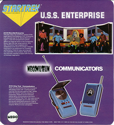
Perhaps it's common knowledge among many Mego Trekkers, but I think a lot of us may not have noticed on the back of the Star Trek 6-Face card is a photo of a very strange looking Enterprise playset: It's a prototype with several differences from the final playset that shipped to stores. This in itself isn't unusual, as package art was frequently produced before the final product was settled.
What surprised me was how many different Enterprise prototypes were lurking around in the Mego Museum Library; Both in the Mego Catalog Section and in the Department Store Catalog Section.
Here's what I found.
 I
had never really taken the time to notice the details in this image until I
added a high-resolution scan to the Library. This
is the same image used in the 1975 Mego Product Catalog that announced the
Star Trek line for the first time. Click to enlarge and appreciate the details
in this Mego artifact. It takes you right back to the art room at Mego headquarters
to a time when an up-and-coming toy company was set to make all kinds of history.
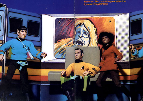
What first jumped out at me is the fact that this is clearly a cardboard
mock-up of what the playset
would eventually become. There is no vinyl covering, and I love being able
to see the flimsy edge of the art board, the uneven line where the transporter
meets the wall. The artwork on the walls is a similar, but much simpler version
of the very detailed, if not totally off-model final product. The rough shapes
are there, but the wall panels have no buttons or
dials and the screens have none of the abstract, geometric imagery on them.
 The
main viewscreen itself is a large square that is obscured behind the early,
undecorated beige prototype of the control console. The idea of a changeable
screen is in evidence at this stage because of the two pins (or studs, or rivets?)
holding the screen in place.
The wonderful painted image appears to be an animated interpretation of the Man-Trap creature and would not make the final cut.
 The
big treat for me, though, has to be the rough prototype of the transporter
itself. As Kevin pointed out, the decal here is magenta and black which differs
from the final American yellow and black but does show up on Palitoy's
Transporter Playset. Here we see, delightfully, an early Mr. Scott, insignia
free and wearing a beige test-shot belt. He
is strapped into the transporter cylinder with black masking tape! It's
hard to say if this is a cardboard mock-up, or an early plastic test, but the
cylinder is obviously slightly rough and wobbly. We see only one knob at the
top to turn it, and no evidence of the two-button mechanism that stops the
spinning transporter.
Was this simply a rough stand-in awaiting the ultimate tooled and engineered
device? Was this an early experiment to hold the figure inside the mini-centrifuge?
An impractical strap approach that was abandoned? We can only speculate at
this point, but I think it's a marvelous view inside the creative process.
You can see the human hand at work. You can smell the glue (and given the
corporate culture of the time you can also smell the cigarettes and Aqua Velva).
Click to see a high-resolution enlargement.
 This
1976 Montgomery Ward page was the first thing that really caught my eye on
this subject. It's our playset, but it's not. The console now has a black-and-white
decal on it, but the design is still rough: It's more aviation and less Sci-Fi.
The viewscreen is now rectangular, and the sample image is similar to one of
the final choices. The walls are still not detailed, and the color seems more
subdued. Given the potential variations in printing and photography, the color
of this item may be exactly the same as the others, or we may be seeing an
experiment in desaturating the candy-colored playset, getting closer to the
TV counterpart. Hard to say, but the colored stripes are still in place and
we may simply be seeing a variation in the work process. Another uncertainty
is the transporter as seen in the detail-box. While it is angled,
it appears to be a narrower door. Hard to tell for sure. This is a vinyl-covered playcase, but we still aren't finished yet.
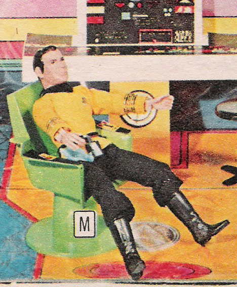
The last clue comes from the 1975 Sears Canada Catalog.
One of the most interesting
elements consistently present in all three images: A completely different Captain's
chair from the familiar chair from the series! It sports a round pedestal base
and lacks the distinctive square shape. A unique and interesting chair and
I'm very surprised it didn't find it's way into another Mego playset somewhere.
Notice the decals peeling up in these pictures.
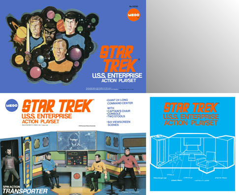
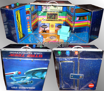 For
much more information on the final product and it's many variations, as well
as other prototypes from Star Trek, explore the Mego
Museum Star Trek Gallery.
Or hang out in the Library! You'll never know what you'll find.

