by Scott C. Adams
Well, there it is. Kind of
a big deal, huh? What you are looking at is the product of
many many hours over the last 4 months, though some of the
ideas have been floating in the back of my head for years.
How did all this happen? As with many things in Megoville
I blame Joe DeRouen.

Sometime in August or September Joe asked me to do some art
for his Megostore website.
I had "retired" from the Mego Museum in 2000 and
it had been a long time since I'd played with Megos in Photoshop.
What fun! Especially since I had learned so much about making
art since my early Mego Museum days. So I had the
taste.
 I
had been promising Brian Heiler for
at least a year or more that I would help him overhaul
the Museum and make it easier for him to update and fix
some really glaring flaws, particularly the frames navigation
that I had been warned long ago I would regret. The site
was hard to update in a consistent fashion because anytime
you wanted to add something someone had to paint a "marble" bust
or stick some greek columns in or whatever...not practical.
Original Museum fonts and files had been lost...it was
a mess.till, the site was huge, and to completely overhaul
it would be such a Herculean task! So nothing happened,
except it ate away at me that the site needed my attention.The
Falcon page had been promising NEW ART since it was created
in 1997! This stuff had been bugging me for years, but
I was busy with the rest of my life. I
had been promising Brian Heiler for
at least a year or more that I would help him overhaul
the Museum and make it easier for him to update and fix
some really glaring flaws, particularly the frames navigation
that I had been warned long ago I would regret. The site
was hard to update in a consistent fashion because anytime
you wanted to add something someone had to paint a "marble" bust
or stick some greek columns in or whatever...not practical.
Original Museum fonts and files had been lost...it was
a mess.till, the site was huge, and to completely overhaul
it would be such a Herculean task! So nothing happened,
except it ate away at me that the site needed my attention.The
Falcon page had been promising NEW ART since it was created
in 1997! This stuff had been bugging me for years, but
I was busy with the rest of my life.
Anyway, flash forward to this fall and I make Joe's Megostore
Banner. Cool. I'm a little inspired. Maaaybe I
can do something SIMPLE.
Don't overhaul the WHOLE site, just make a new navigation!
Keep it simple, don't bite off more than you can chew, this
will take a week and a half! But what navigation? How to
best present so much information?
Well, you know how the Mego Museum art always tried to make
it look KINDA like a real place, sort of successfully, kinda
not so much. I had always thought that if there was a building
called the Mego Museum it would look like this:
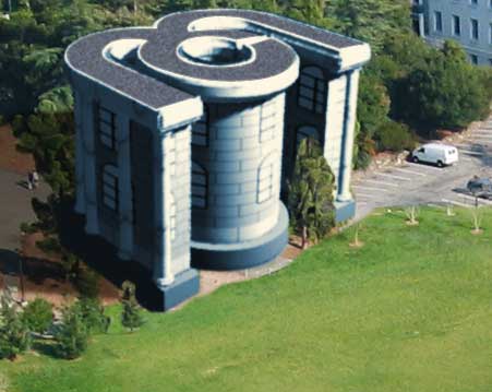
The classic Mego Logo extruded into a giant building with curved
gallery walls and lots of glass. Some nice landscaping maybe.
I made this Photoshop sketch and thought I was onto something.
So if the Museum looks like that, what do all Museum's have?
A map.
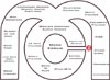
Cool! Mego logo map. Now how to organize it? This went through
several phases, but didn't start to feel good until I added
the small colorful circle Steve did for Mego Scarcity Project
and that people use in Mego Buzz.
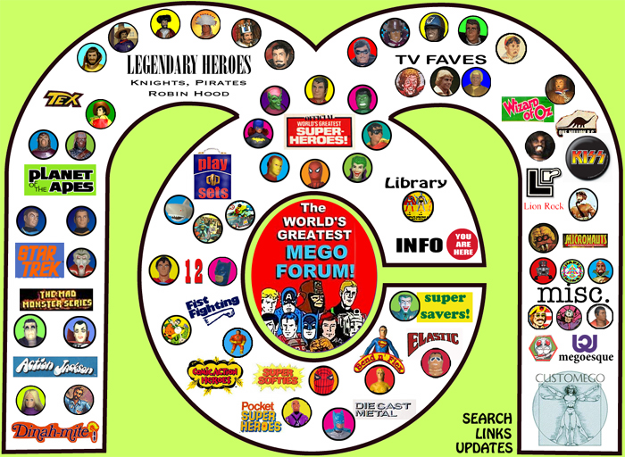
That gave a sense of FUN, and it was supposed to be fun.
I love the old Museum concept, but after a while, all the gray
green marble was seriously bumming me out.
So, it was realizing that fun must be the priority that opened
this up for me. Suddenly my cool 3D building was a BIG
MARBLE LOGO. Cool, but...fun??? Enh. So I was talking
with my friend Ben "Imp" Holcomb,
(a brilliant graphic designer and Mego genius who gave me
tons of valuable advice on this project) and I believe it
was he who mentioned that I use a playset.
I can't recall be more excited by an idea in my life. I LOVE
Mego vinyl case playsets. Vinyl encased cardboard riveted
together with a brass clasp. That's the essence of Mego play
to me. Plus, playsets come in boxes and I LOVE Mego boxes.
Within an hour I had put this rough together and was off
to the races.
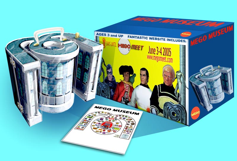
The "map" soon became a playset instruction
sheet and the colorful circle gave way to repro-art, which
I had fallen in love with thanks to the Mego
Library.
I can't put it all together, the whole evolution of this project.
I wanted to kill the frames and icon dependant galleries,
but how to navigate the different lines? Wasn't text boring?
Not at all. Ben showed me how to use Cascading Style sheets
that make it much easier to do web design and I really got
inspired. That lead to the gallery format we have today.
 The
art was still going to be a problem, though. Did I really
want to paint new backgrounds for the dozens and dozens
of different Mego figures? That was too much work. I wasn't
sure what to do, but necessity is the mother of invention.
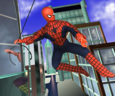
Brain had come up with this trading card idea and Steve
had helped him design it, and it was cool but the problem
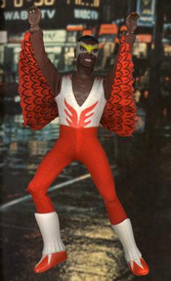
was the art. The Spiderman picture, in addition to being
really tired and ugly (You may like it, and I appreciate
that, but I've been looking at it for almost 10 years now!)
was way to small to print nicely. Plus, we were doing this
whole redesign, the cards should look like they fit with
the new website. I asked him to let me take a crack at
it--but he had to go to press in a few days. I didn't have
time to paint a background. The
art was still going to be a problem, though. Did I really
want to paint new backgrounds for the dozens and dozens
of different Mego figures? That was too much work. I wasn't
sure what to do, but necessity is the mother of invention.
Brain had come up with this trading card idea and Steve
had helped him design it, and it was cool but the problem
was the art. The Spiderman picture, in addition to being
really tired and ugly (You may like it, and I appreciate
that, but I've been looking at it for almost 10 years now!)
was way to small to print nicely. Plus, we were doing this
whole redesign, the cards should look like they fit with
the new website. I asked him to let me take a crack at
it--but he had to go to press in a few days. I didn't have
time to paint a background.
So I turned to photographic backgrounds and some simple Photoshop
tricks (Posterize and Find Edges) and suddenly had an art
style that was punchy and fun and very quick for me to do.
It's been a huge project, and I don't think I've worked harder
or longer on a personal project in my life. Weekend, nights,
and on the bus during the commute I've been trying to figure
out this giant art puzzle called the Mego Museum. It's been
an enormous amount of fun and extremely satisfying to come
back and rebuild something I have never been satisfied with.
I believe that the redesign will make it easier for the Museum
to grow and thrive as it enters it's tenth year and beyond.
I'll be proud to have my name on it. I hope you enjoy it and
keep coming back. Brain and I have great things in store.
A few thanks: Brian Heiler
for doing such an incredible job keeping the Museum growing
and thriving. He's a great person to work with, as are Joe
and Anthony and all the regulars at the Museum. This
might not have happened and certainly wouldn't look as good
without Ben Holcomb's input.
Thanks, man, you rock. Lastly, my bride-to-be, Julie,
who has been so supportive and encouraging. She isn't crazy
about the Mego display cases in her house, but she always lets
me be who I am.
And thanks to you!
Best,
Scott
|