

 Tweet
Tweet
^^^I like the last update by Emeraldknight. Nice font and color tone selection that really drives that design concept home. Good work! This has been a true community effort. Nice to see this happening here. Great ideas.
-
-
Shouldn't there be a comma after the word beer?Comment
-
To avoid the comma confusion (I personally don't use a serial comma), maybe change the word "and" to the symbol "&". The word "and" somewhat takes away focus from the words pizza, beer and mego. Using the ampersand solves both "problems".
Again, the logo is just plain awesome! Great work!Comment
-
Even though I made some comments myself, I should also point out that too many cooks spoils the broth. The latest version of the logo is completely awesome the way dr_cyclops set it up, and there's a point of diminishing returns on the comments and helpful suggestions... let's not drive the poor guy nuts here!Comment
-
I think the design is great.
I would buy one on a shirt.
Where is this event located?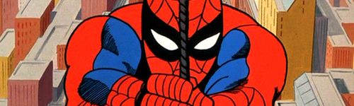
Comment
-
This event is located just north of portland Oregon in downtown vancouver Washington state, RottingDead....However, if this goes well as far as attendance and fun had by all... I'm from Bucks county, Pennsylvannia and I go back to visit family every summer and was thinking of doing something like this in the tri-state area. I even have a place in mind and was about to send a letter to the establishment (i know, I'm crazy)INEPT VINTAGE WISENHEIMER
WANTS: Thrashed Riddler Box, RM mask (beater ok) ...and a ponyComment
-
Perhaps my last post was a little vague. By (almost) quoting the Eagles "Already Gone". I meant that the piece is complete. All the critiques here really helped. From my inability to change the hands without diminished returns, to spotting and correcting the circle suit problem, I must say I couldn't have perfected this without you considerate members.
My greyscale and color images have been sent to mikeMc4. there really is no need to post them here, since they are not unlike the images contributed here by emeraldknight.
As for the font, I know there are members here who didn't like my choice. I really was looking for something 'better'. When emeraldknight47 posted the neon style, some member may have wanted that way. All I can say is, Graphic Design Logo Rule #1: Logo are designed large to be greatly reduced and still remain legible and identifiable. Neon font is too busy to survive this process.Comment
-
Id have spidey looking a bit confused, as to where he is exactly meant to place the pizza in his mouth, and guzzle his beer
Comment
-
The non-gray version is better. Shades of gray make the picture too dark, in my opinion.Comment

Comment