-
Man...thanks for the math/measurements...much appreciated!
Yeah, I think the THE is too much...a stand alone DAILY PLANET is more clean...agreed.
It will only be placed on one side...it's not a rotating globe...so a two-sided DAILY PLANET sign doesn't make sense...plus it will be expensive enough for the letters...I don't wanna spend twice as much...

Leave a comment:
-
-
I have always loved your Daily Planet globe, Scott..and I have to say...yours was the inspiration for my project...


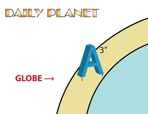
I will get thick enough letters (3D freestanding), because I plan on drilling the bottom...and screw them on top of the metal ring.
Sort of like this...
Last edited by Hector; Jan 25, '12, 12:01 AM.Leave a comment:
-
How are you going to do the letters? 3d freestanding or applied to a ring?
I know you've seen this before, but I'll post mine for inspiration. My font was pretty average, but it as what I found at the art store.

Leave a comment:
-
Gold letters,14 karat gold. The globe in the first pic looks black with the sun reflecting off it,i think that one looks cool.
Leave a comment:
-
I'd just go with DAILY PLANET like in your pics.As far as the letter size,i did a quick measuring of your first pic,i'm sure they all vary some but its aproximately 4 inches and the letters are about 3/4 to one inch which is 1/4 the width of the globe.Your globe is 16inches so 1/4 of that is 4 inches.I would draw(rough sketch) it out full scale and see which size letters either 3in or 4in look most like whatever pic you are going to base this on.Leave a comment:
-
I would just go with "Daily Planet".
The font looks pretty close. The captial "Y" is the only one that looks notably different (although it is much closer in lower case).
But before you order anything, print out a trial run on your printer and make sure it looks exactly the way that you want with your globe and all the rest. Even just pasted onto cardboard or whatever, it will help you ensure the style and scale are right, and help you figure out how you are going to assemble it all together.Leave a comment:
-

What you guys think...
I'm going to paint the globe metallic gold.
Now...
What would look cooler?
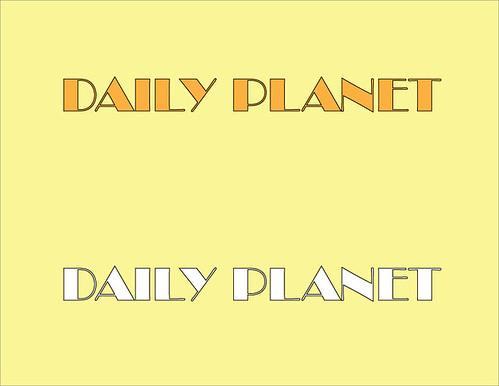
Gold planet, gold letters...
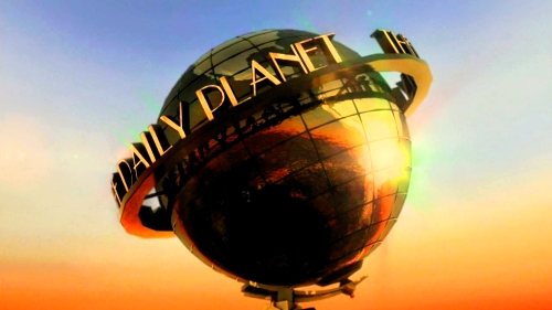
Gold planet, white letters...

I need input, people!


Leave a comment:
-
Man i wish I knew what to tell ya here bro, i know nothing about customs But i have a feeling you'll be good at it bro..you're artistic and creative..you'll be fine
Leave a comment:
-
Right now I'm dealing with the logistics of custom order letter fonts...they are very pricey...so I'm shopping around for a good deal.
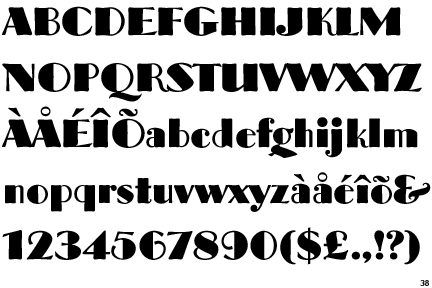
I would prefer metal/aluminum...but they are just way too expensive (and I do mean EXPENSIVE)...I found a place that makes acrylic letters at cheaper prices...it took me an entire week of googling on the net...and finally found a place that makes them in the font design I want...Broadway...

A computer rendering:
I'm still deciding to order either 3" or 4" tall letters...the globe's ring will be about 16" across. The letters will also be about 1/4 to 1/2 inch thick.
Now...should I just place DAILY PLANET? Or include the THE...THE DAILY PLANET?
Leave a comment:





Leave a comment: