
-
-
Clemso,
It is not a color correction issue. My designer friend and I have spoken over the phone about the blue background color. Personally I think the color was a bit too deep on the digital scans of "geoffdude's" original Aquashark box (too dark and too red of a blue) from what I saw on my computer monitor and so does he from what his monitor showed him. I think the color he used is a better blue but who really knows for sure as I'll do my best to explain below.
I tried to answer your question as best I could in my previous post where you quoted me (see below)....but in case I was not clear in my description I'll quote myself and do my best to explain a little further:
"The designer will match the blue background and wave patterns around the cello window as closely as he can to what he thinks the original box looks like from several different sources that I have provided for him. Without an actual box in hand to go by this will have to be approximate...but he has assured me it will look great when all is said and done. Even the high res scans are not 100% perfect color wise but he will make it aesthetically pleasing so hang tight."
In other words......nothing is final until it's final and even the colors on the scans can be inaccurate as I have found from doing some of my own scans from original Mego 8" figure boxes (my own collection) just last night.....and no matter what it looks like in digital form what really matters is how the colors look in the print out. Colors do not replicate 100% accurately from what a computer monitor shows in the digital file because you're dealing with colored light on a computer monitor vs. dyes/inks in printed form.
This is the one drawback from posting images online....every monitor is calibrated differently so what you are seeing is not necessarily what I am seeing and vice versa. I don't want people thinking that these "in-progress" images are final images.......they are simply "in-progress" screen shots and what matters is the type of board used to print on (how it absorbs the ink) and the color of the printed "proof". If colors need adjusting then my designer friend will make the necessary adjustments until the print is aesthetically perfect. Without the actual box in the hands of the printer he's "flying blind" with nothing but a digital file (a second generation image) to work from that most likely has shifted in color from the original anyway.
Which leads me to my next point....the only way to be 100% accurate to the printing of the original box is for the designer/printer to have an original box in hand and adjust the printed proof until the print colors look exactly like the original box. But even so the box today has aged over 33 years so the colors are most likely not 100% accurate to the way they were in 1978 when the boxes were newly printed and rolled off the production lines. There's just no way to be 100% accurate to the colors of the original box from 1978 (colors may have faded a bit and cardboard does yellow over time unless it's archival quality - acid free - which Mego boxes were not) that will affect the printed color with age) when it was new so there will be a little bit of guess work on the part of the designer for color matching, but have faith....my friend has printed every mego 8" WGSH box from either his own personal collection or someone else that has sent him original boxes to scan. He is very aware of the colors that Mego made use of for the majority of their Superhero figure/sets lines and he will do his dead level best to make the colors look the best they can for the repro box.
I hope that helps clarify things a bit.
More to follow. Stay tuned. Last edited by reevefan78; Feb 28, '11, 8:26 PM.
Comment
-
looking great. can't believe the amount of time and effort you are putting into this. Cannot wait to see some production samplesComment
-
An intermediate cast from the "trash mold" is on it's way......I got this email message from my mold maker friend yesterday afternoon (Feb. 28):
"Still on schedule to make the resin Aquashark Tomorrow or Thursday."
I will ask him to take a pic of the copy prior to and after the necessary adjustments are made (i.e. logo replacement, walling off the back of the throat, etc.) before making the final mold and production casts. Stay tuned...more to follow soon.
Comment
-
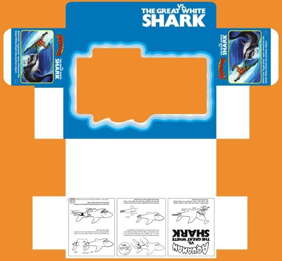
Exploded box design - complements of Greg Jensen (AKA dengar)
Hey guys,
Here's a pic of the basic box design courtesy of Greg Jensen (AKA "dengar" on Ebay and my designer friend on this repro box). "Geoffdude" has been a Godsend in giving me and Greg access to scans of his original "Aquashark" box set. Greg is doing a "fin-tastic" job so far.....just keep in mind these are temporary placement templates and do not represent the final box design. This is what Greg has so far for the exploded box layout prior to any detail begin added. BTW.....the wave pattern that surrounds the cello window (window is red....this will be the cut out area like the original with an acetate window put in it's place) is accurate to the original and created directly from "Geoffdude's original box scans.
I've asked "Geoffdude" to send me (and Greg) pantone color numbers (http://www.pantone.com/pages/pantone/index.aspx) that he (Geoffdude) will match to the colors on his original box to give Greg an idea of exactly what colors he (Greg) is trying to match in the final print proof for this repro box......and as usual "Geoffdude" is all too happy to help out.....what swell guys you both are - Geoff and Greg!
Enjoy.....more to follow soon....stay tuned!
Exploded (flattened) "Aquashark" box design by Greg Jensen

"Geoffdude's" Original Mego Aquaman VS The Great White Shark set

Comment
-
Clem,
Yes, it is difficult to match the blue, LOL......(since we really have nothing solid to match to). I blame my "thorough reply" on my background as an art instructor....... :-)
I'm glad I was able to clarify the reasons it's difficult to match the blue background on the original box though.
All of us involved are striving to make this Mego Shark repro project the very best we can and I am very fortunate to be working with some very talented and passionate individuals. Thanks for all the support and encouragement that you and everyone else following this thread has and continues to give us......I don't think anyone will be disappointed by the final product. More to follow soon.....stay tuned.
Comment
-
I think 99% of the people will agree having a slight color variance is a good thing because it makes it more detectable as a reproComment
-
Wow!
Is the Museum a great place or what?
Rock on, man! Chalwa AKA The Pre-Crisis Chris
Chris' Blogs:
The Misadventures of Captain Blog
Comic Book Fanzines: Chain Letters for Disturbed Children
When I am grown to man's estate,
I shall be very proud and great.
And tell the other girls and boys,
not to meddle with my toys.
-Robert Louis StevensonComment
-
Repro Aquashark box will utilize CMYK Pantone Color Matching System for printing
Mmmmmmmm.......not sure about this Mikey. First off this would assume that people have seen an actual boxed set that had minty colors (not faded or discolored or waterdamaged) and remembered the exact colors they saw on the box. I had one of these sets as a child but it's been 33 years since I've seen the box.......wish I had known better back then.....LOL. As an artist and someone who has an excellent memory I doubt even I could remember the exact colors and pick them out to be spot on. So with that said I think as long as the box colors look aesthetically pleasing and are as close as our research suggests that is all that will matter.
BTW.......just to let you and Clemso know......you both got me thinkin'....."there must be some way to get these colors matched from 'geoffdudes' original box set so that Greg will be able to match the colors to those on geoff's box." Then it hit me.......use Pantone color charts like my designer friends had to do in art school back in the early 90s. So I emailed Geoff and he said he could match the colors on the box to the appropriate Pantone color swatches and use the CMYK (Cyan, Magenta, Yellow and Black) codes on the back of the swatches for printing the colors as closely as possible to Geoff's original box set.
As usual Geoff was all too happy to help us out once again........what a SUPER GUY!
So long story short.......Greg's box design will utilize accurate color matches to Geoff's original box set using the Industry standard Pantone Color Matching System.
More to follow soon. Stay tuned!
Comment
-
You should consider running off some variant boxes with Mego's original intention/implication...

VS.

and try to replace the insert or box art somehow with a variation of this, Aquaman replacing the female swimmer

Comment
-
Clem.......Heavens no! That's blasphemy to a collector and I would never ask Geoff to do that......that might even be grounds for excommunication from the Mego Museum forum....it'd make headlines everywhere.....I can see it now "Crazed Collector asks friend to vandalize rare Mego box set valued at over $5000 for own selfish purposes"......that would definitely send me straight "to the chair" if other collectors got hold of me for doing something like that! LOL
Comment
-
Shhhhhhhhhhhhhh! Not so loud....we wouldn't want to wake up ol' Bruce now would we? He might be a bit grumpy seeing how he hasn't been the star of his own film since 1987, LOL.
Seriously though.......I'm already ahead of you with something that I hope will thrill other JAWS fans. I saw the movie when I was 4 and I've been "hooked" on it ever since. It is my favorite movie of all time....right up there with Superman the Movie and Superman 2: The Donner Cut as well as Alien, Aliens, Star Wars, The Empire Strikes Back, John Carpenter's Halloween and The Thing, Black Christmas (the 1974 original), Reign of Fire, etc......well you get the picture. Anyway, I don't want to be a "spoiler" so I'll just say that I'm already thinking ahead into the future with this project. Nuff said. More to follow....stay tuned!
Comment
-
Latest In-progress shot of the "Aquashark" repro box 3.3.2011
Here's the latest update pic just sent to me today courtesy of Greg Jensen (AKA dengar of Ebay using original "Aquashark" image pics from "Geoffdude") of the "Aquashark" repro box in progress. Remember this box is shown unfinished....without the Aquaman logo and other type that is still to come. More to follow.....stay tuned!
P.S. Oh and don't worry about the colors.....they've been matched to the original box as closely as possible using the Pantone Color Match System for printing......just thought I'd reiterate that.
 Last edited by reevefan78; Mar 3, '11, 3:59 PM.
Comment
 Tweet
Tweet


 but thank you for your thorough reply. I can see that your putting loads of effort into this, so I am sure this Shark is going to rock!
Comment