Help support the Mego Museum

Announcement

Collapse
No announcement yet.

King Kong vs Godzilla new poster

Collapse
X
 
  • Time
  • Show
Clear All
new posts
  • Hector
    el Hombre de Acero
    • May 19, 2003
    • 31852

    #16
    They are beautiful...they have that almost Andy Warhol pop art look to them...very 60s.

    The one that kinda does not work for me is the Aliens poster...for alien is futuristic...and these are kinda throwbacks.
    sigpic

    Comment

    • cjefferys
      Duke of Gloat
      • Apr 23, 2006
      • 10180

      #17
      Wow, those really remind me of Godzilla theatrical posters that were released in Poland back in the day. Polish movie posters had a really distinctive, unique look (I don't know about now, but they did back in the 60's and 70's).

      Do a Google image search for "Polish Godzilla Poster" and see what I mean.

      Comment

      • ctc
        Fear the monkeybat!
        • Aug 16, 2001
        • 11183

        #18
        >Polish movie posters had a really distinctive, unique look

        There's a few here:
        Lost In Translation: 20 Baffling Foreign Movie Posters | Cracked.com
        15 Grossly Misleading Movie Posters | Cracked.com

        Don C.

        Comment

        • Meule
          Verbose Member
          • Nov 14, 2004
          • 28720

          #19
          Originally posted by ctc
          >Polish movie posters had a really distinctive, unique look

          There's a few here:
          Lost In Translation: 20 Baffling Foreign Movie Posters | Cracked.com
          15 Grossly Misleading Movie Posters | Cracked.com

          Don C.
          This one isn't from France by the way, it's from Belgium
          "...The agony of my soul found vent in one loud, long and final scream of despair..." - Edgar Allan Poe

          Comment

          • samurainoir
            Eloquent Member
            • Dec 26, 2006
            • 18758

            #20
            Originally posted by palitoy
            Rob Kelly does some wonderful work that sometimes gets used at retro cinemas:

            Checkout the full domain details of Namtab.com. Click Buy Now to instantly start the transaction or Make an offer to the seller!


            Rob Kelly Illustration: monster posters
            The dinnerware stuff is fun!
            My store in the MEGO MALL!

            BUY THE CAPTAIN CANUCK ACTION FIGURE HERE!

            Comment

            • MightyMegs
              Veteran Member
              • Jan 5, 2009
              • 459

              #21
              Originally posted by Meule
              This one isn't from France by the way, it's from Belgium
              http://cdn-www.cracked.com/articleim...sters/kong.jpg
              WOW... Kong's fighting Jaws and the Titanic!

              WE NEED A BIGGER BOAT!I'M KING OF THE WORLD!

              Comment

              • mazinz
                Persistent Member
                • Jul 2, 2007
                • 2249

                #22
                Originally posted by MightyMegs
                http://cdn-www.cracked.com/articleim...sters/kong.jpg

                WOW... Kong's fighting Jaws and the Titanic!

                WE NEED A BIGGER BOAT!I'M KING OF THE WORLD!
                that poster is actually for the giant ape film called "A.P.E." which was a Korean King kong ripoff
                "What motivated him to throw a puppy at the Hells Angels is currently unclear,"

                Starroid Raiders Dagon wrote "No Dime Store Monster left behind"

                Comment

                • Brazoo
                  Permanent Member
                  • Feb 14, 2009
                  • 4767

                  #23
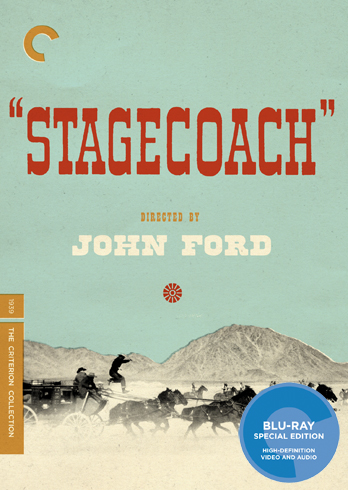
                  These kinds of retro-restyled posters have been going on for a while now. I think "The Criterion Collection" DVD packaging and their interesting designer choices have inspired these reworkings - also Saul Bass' design style has become SUPER trendy in the music poster world the last few years - so now the music poster guys are doing movie posters and it's going full circle.
                  Last edited by Brazoo; Nov 16, '10, 1:45 PM.

                  Comment

                  • samurainoir
                    Eloquent Member
                    • Dec 26, 2006
                    • 18758

                    #24
                    ^^^
                    I think this style also has to do with vector based software like Flash and Illustrator becoming tools of choice about ten years ago when interactive media needed the versatility and ability to resize and export easily between platforms and media. I know it makes our lives easier when outputting both the web and print stuff on any given project.
                    My store in the MEGO MALL!

                    BUY THE CAPTAIN CANUCK ACTION FIGURE HERE!

                    Comment

                    • Brazoo
                      Permanent Member
                      • Feb 14, 2009
                      • 4767

                      #25
                      Originally posted by samurainoir
                      ^^^
                      I think this style also has to do with vector based software like Flash and Illustrator becoming tools of choice about ten years ago when interactive media needed the versatility and ability to resize and export easily between platforms and media. I know it makes our lives easier when outputting both the web and print stuff on any given project.
                      Yeah, great point! For sure vector art, flash cartoon design and a few other factors are involved in this kind of retro style coming back.

                      Vector art and halftones work perfectly with screenprinting, which is also really trendy process for collectable designer posters. There's TONS of trendy design stuff faking the look of screenprinting now too. Stuff where the colours are purposely not lined up correctly to look like a badly registered screenprint, and using noticeable halftones.

                      Here's a DVD I just picked up that looks screenprinted, even though it's not. You can see the orange and blue/green are slightly off, and the contrast of the photo is blown out with a digital half-tone filter on it:


                      Just to bring it back to horror movies here's one of my favourite Criterion Collection covers by poster artists Aesthetic Apparatus from a few years ago:

                      Last edited by Brazoo; Nov 16, '10, 10:11 PM.

                      Comment

                      • Brazoo
                        Permanent Member
                        • Feb 14, 2009
                        • 4767

                        #26
                        Things are kind of backwards - screenprinting was a totally commercial way of printing until Andy Warhol started using it ironically to blur the lines between product and art. Now we think of it as artistic instead of commercial.

                        Screenprinters did everything they could to register print colours correctly and make halftones smaller and less noticeable, and now that we have the technology to easily eliminate these flaws people are using filters and digital tricks to recreate them. Somehow the faults of older technology look more organic to us now. It's kinda weird, but I have to say I'm a huge fan when it's done right.

                        Comment

                        • cjefferys
                          Duke of Gloat
                          • Apr 23, 2006
                          • 10180

                          #27
                          Criterion have always had some interesting cover designs for their releases. Some I like, some I don't, but definitely better than the "floating heads", uninspired covers for most major studio releases these days. Big fan of Criterion's DVDs and Blu-rays too.

                          Comment

                          • Brazoo
                            Permanent Member
                            • Feb 14, 2009
                            • 4767

                            #28
                            TOTALLY - they have their misses for sure - but I do like that they take chances and get interesting designers. They really seem to think about which designers to pair with which movies. Sometimes I also miss the original art, especially with some of their vintage releases.

                            I hate most DVD packaging and movie art these days too.

                            Comment

                            • babycyclops
                              Career Member
                              • Jul 9, 2010
                              • 823

                              #29
                              Originally posted by Brazoo

                              Just to bring it back to horror movies here's one of my favourite Criterion Collection covers by poster artists Aesthetic Apparatus from a few years ago:

                              http://ecx.images-amazon.com/images/...500_AA300_.jpg
                              Oh wow! I watched that Dr Mabuse film a couple of years ago for the first time. Wild stuff!
                              The Criterion package for Videodrome is really nice too.

                              Comment

                              Working...
                              😀
                              🥰
                              🤢
                              😎
                              😡
                              👍
                              👎