

-
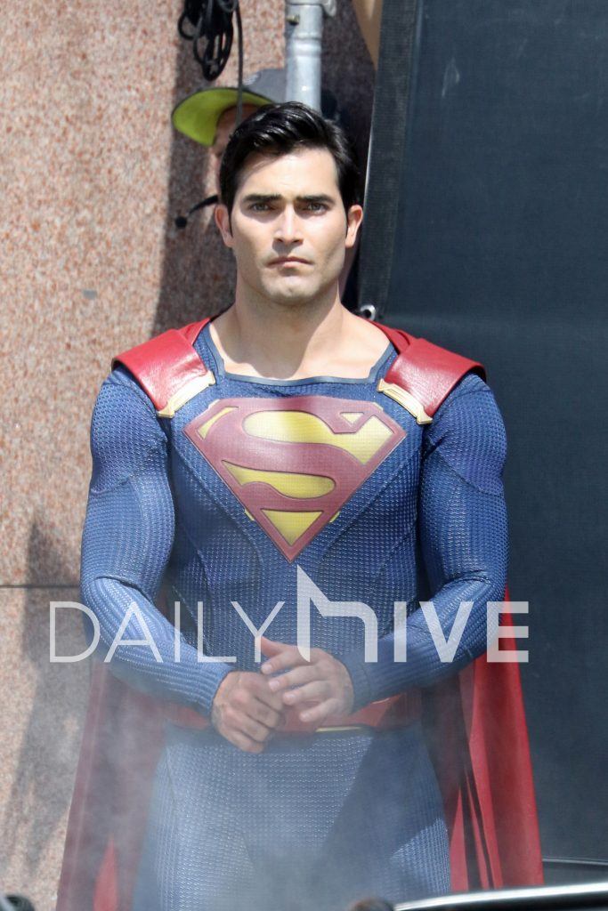
The texture looks like long thermal underwear, didn't they ditch the red undies to avoid that look in the first place? -
Quite true about the cape position and belt. Overall, I like the suit, and him. He was pretty intense in Teen wolf, I can see him as a strong, slightly paternal Superman.Leave a comment:
-
Obviously, the reason the costume is that way is that these are political "intellectual property/artistic" decisions we're seeing... it's choices all based on the Supergirl production team going "How can we do something that relates to older versions of the suit--- but with something new?"
So, when I see all this "shin guard" bashing, I think "Well, obviously those things---like everything else on the costume-- are decorative--- not there to protect his shins."
That said: Those "shin guards"? You can thank those things for allowing the flexibility to have that classic "S".
That said: If I was complaining about any detail of the costume, I'd put in my agreeance with enyawd72---that, it's the cape that is a major problem, yeah, but particularly thedetail.... that same cape would work much better by simply getting it more flush with the neck hole.the large clasps of the cape...they need to move it back flush with his neckline,
The big costume win?
If you're going to ditch the briefs---that BELT is the perfect way to go: Red with yellow trim. That design is the best concept for retaining the briefs color scheme within the surface area confines of the belt.
Too bad all other New52/modern Supermen haven't gone that route.Leave a comment:
-
He kinda resembles young Bruce Campbell. Give him a chainsaw.
I'm fine with it, but it's the internet, so let's poke fun, shall we? The suit is so textured it's comical. Looks like Lara may have knitted it for him on Krypton. And thank goodness his Kryptonian shins will be protected should he decide to participate in the World Cup.Leave a comment:
-
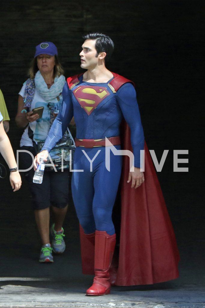
The new pics look more like his natural self...odd how he and Cavill look short compared to Reeves and Welling. I guess Cain never came across that tall, either.Leave a comment:
-
Like others have mentioned I hate those cape clasps. Still I just don't get the Superman vibe from this actor's look.Leave a comment:
-
One thing about the costume I'm really digging is the "S" shield. It's pretty much the actual "S" symbol we've seen on merchandise since at least the early 80s when they finally defined the look. The only small change is to the upper left corner. Where the tip of the "S" meets the red border, it flares outward a bit, and isn't straight. That's pulled directly from the Christopher Reeve Superman symbol, and I've always preferred that.


ChrisLeave a comment:
-
Ok, that's better...the new a pics make a BIG difference. I can now see him as Superman.
Leave a comment:
-
Yes, he does look better in those newer pictures.
And I agree with most about the whole "cape clasp" thing. That is a bad design choice.Leave a comment:
-
-

Once you look at the new photos it does cast new light on Tyler.Leave a comment:
-
As I said earlier, these pics actually give him a much more "Superman"ey vibe, but is it WB/DC edict that all persons playing Kal El must now wear an expression of disdain, mopiness or overall "meh." I'd love to get another Superman who actually does smile and laugh and rescues cats from trees and helps little old ladies avoid getting run over by cars. Only thing I can figure is that any onscreen Superman's lighthearted nature and ability to inspire hope and justice in normal schmoes must've gotten packed away with his red trunks...Leave a comment:
-
In these pics, he looks better . . . the suit not so much. The boots are bulky, and the cape has a funky scifi-paperback cover look that really bugs me. In fact, add wraparound sunglasses, and it's actually a better take on a live-action Kryptonian/Eradicator Superman than Superman himself.
I really don' get why this costume is so hard to get right these days.Leave a comment:


Leave a comment: