Help support the Mego Museum

Announcement

Collapse
No announcement yet.

Alternate look at new Justic League

Collapse
X
 
  • Time
  • Show
Clear All
new posts
  • Random Axe
    The Voice of Reason
    • Apr 16, 2008
    • 4518

    Alternate look at new Justic League

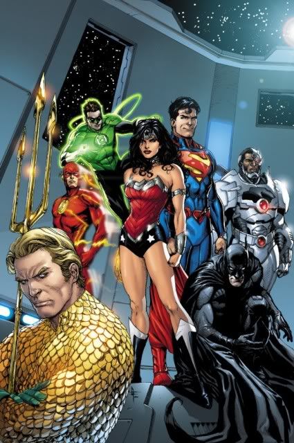
    As much of an abortion as I think this new 52 has become, I find it fascinating how another artist's interpretation can improve on the ideas set forth by JIm Lee. As time passes, I find Lee's work more and more stagnant and uninspired. Enter Gary Frank, possibly my favorite contemporary artist to draw the cover to issue seven. Suddenly the redesigns don't look so bad and the Superman in armor isn't nearly as offensive. Frank is able to give each character a bit of charm and distinct look, far superior to Lee's cross hatch vomitting on the page. I kinda dig this.


    I almost had a psychic girlfriend but she dumped me before we met.

    If anyone here believes in psychokinesis, please raise my hand.
  • samurainoir
    Eloquent Member
    • Dec 26, 2006
    • 18758

    #2
    I kind of prefer Frank's interpretation of Superman that was closer to Christopher Reeve.


    Digging that Wonder Woman though. Cyborg is just too chunky in this incarnation. He really should be much more sleek and streamlined to reflect more contemporary design aesthetics... like an Iphone.
    My store in the MEGO MALL!

    BUY THE CAPTAIN CANUCK ACTION FIGURE HERE!

    Comment

    • The Toyroom
      The Packaging King
      • Dec 31, 2004
      • 16653

      #3
      I'm digging Frank's brooding take on Aquaman...although does he have to carry that trident everywhere he goes?

      Cyborg looks more machine now...whereas originally he was half and half....from the looks of it only his head survived...
      Think OUTSIDE the Box! For the BEST in Repro & Custom Packaging!

      Comment

      • Random Axe
        The Voice of Reason
        • Apr 16, 2008
        • 4518

        #4
        I'm guessing this is the current look of the team and the prequel storyline in issues 1-6 is far behind. I noticed Flash doesn't have the armor piping and it's been minimalized from what is shown on both Superman and Batman. I like the Wonder Woman outfit here. Of course I'll always prefer classic costume, but this is fresh and befitting a warrior.

        I completely agree on cyborg. He looks like a mech from warhammer. Still missing Jonn...
        I almost had a psychic girlfriend but she dumped me before we met.

        If anyone here believes in psychokinesis, please raise my hand.

        Comment

        • Random Axe
          The Voice of Reason
          • Apr 16, 2008
          • 4518

          #5
          Oh yeah, the new red belt on Supes works quite well and is a partial substitute for the trunks. If this wasn't Superman I'd say it's a great design. As is, it's growing on me.
          I almost had a psychic girlfriend but she dumped me before we met.

          If anyone here believes in psychokinesis, please raise my hand.

          Comment

          • rche
            channeling Bob Wills
            • Mar 26, 2008
            • 7391

            #6
            is it cyborg or deathlok?

            Comment

            • jwyblejr
              galactic yo-yo
              • Apr 6, 2006
              • 11147

              #7
              Just add some spikes and a cape and Cyborg could be a Stryfe knock-off.

              Comment

              • madmarva
                Talkative Member
                • Jul 7, 2007
                • 6445

                #8
                See, when I saw this cover, my initial thought was Crime Syndicate.

                Superman has a kind of a pervy look on his face (although I appreciate the spit curl), Wonder Woman's costume looks lingere with some bondage bracelets, Batman's creeping around on the floor and Aquaman looks like he's got some coral stuck in his tights.

                I've always thought heroes should look inspiring, not intimidating. Of course, on this new Earth, I guess they are all considered untrusted outlaws.

                Don't get me wrong, I really like Frank's art, but this doesn't really have a JLA feel to me. I'm sure he was instructed in what type of attitude the team should have for the piece by his editor.

                Plus, the JLA book has been a real disappointment to me. It took 5 issues to tell about as much story as you would get in about half an issue of any average team book from the 70s or 80s, and Darksied has barely appeared. And Johns is going to wrap the story up in 1 issue?

                Maybe things will start moving when this arc ends.

                Comment

                • BlackKnight
                  The DarkSide Customizer
                  • Apr 16, 2005
                  • 14622

                  #9
                  I don't care much for that image myself ....
                  Superman's look , looks worse to me ...., and I didn't mind Aquaman's new look either, till I saw this image.


                  As far as writing goes ..., I like the Direction WonderWoman's carefree-battle charge Opinions have taken a hold of her ...., It's really JLU Like, and I don't mind it for the character.

                  Bruce is always and Arsehole ...., I don't care much for Jordan just being that much of a Jerk.

                  It's not an all bad book ...., But the Slowness and costume changes is disapointing.
                  ... The Original Knight ..., Often Imitated, However Never Duplicated. The 1st Knight in Customs.


                  always trading for Hot Toys Figures .

                  Comment

                  • bobws
                    Permanent Member
                    • Feb 13, 2008
                    • 3479

                    #10
                    Not a big fan of Frank's work , but..... this looks pretty good.
                    "Hang on Lady... We go for a RIDE!" - Shorty to Willie Scott.Best movie line from Indiana Jones & the Temple Of Doom

                    Comment

                    • thunderbolt
                      Hi Ernie!!!
                      • Feb 15, 2004
                      • 34211

                      #11
                      Looks just as bad to me. Wake me when this is over.
                      You must try to generate happiness within yourself. If you aren't happy in one place, chances are you won't be happy anyplace. -Ernie Banks

                      Comment

                      • The Bat
                        Batman Fanatic
                        • Jul 14, 2002
                        • 13412

                        #12
                        Originally posted by BlackKnight
                        I don't care much for that image myself ....
                        Superman's look , looks worse to me ...., and I didn't mind Aquaman's new look either, till I saw this image.
                        I'm with ya BK...I don't like that picture or Frank's art at all.
                        sigpic

                        Comment

                        • thunderbolt
                          Hi Ernie!!!
                          • Feb 15, 2004
                          • 34211

                          #13
                          Isn't Frank one of the many photoshopper /artists out there?
                          You must try to generate happiness within yourself. If you aren't happy in one place, chances are you won't be happy anyplace. -Ernie Banks

                          Comment

                          • emeraldknight47
                            Talkative Member
                            • Jun 20, 2011
                            • 5212

                            #14
                            Frank does an okay job with this interpretation of the JL, but you can still see the extremely heavy hand of Jim Lee there as well, as if Lee were standing over Frank's shoulder saying "Okay---now put this line here and this line here." It looks good, but just a little too cloned, for me.

                            I'm digging that Aquaman is finally gaining some notoriety as character, but I agree---does he have to carry that trident EVERYWHERE? (I think a funny picture would be to see a stall in a men's room somewhere, the door closed, a pair of green booted feet on either side of the porcelain throne and you see the trident propped up against the inside of the stall. Or maybe Aquaman at a salad bar with the attendant telling him they have their own forks for customer use).

                            And, yeah, in our current age of modern electronics, with phones and chips and gears and thingamobs and doodads all getting smaller, WHY is Cyborg SO much bulkier that he was in the original George Perez incarnation...?
                            sigpic Oh then, what's this? Big flashy lighty thing, that's what brought me here! Big flashy lighty things have got me written all over them. Not actually. But give me time. And a crayon.

                            Comment

                            • The Toyroom
                              The Packaging King
                              • Dec 31, 2004
                              • 16653

                              #15
                              I think the book is slow paced for a few reasons.... 1) it's the write-for-the-trade mentality 2) Johns is catering to Lee's strength as a notoriously slow pin-up artist. You would see a lot more story if Ethan Van Sciver or George Perez were on the book. While both are also slow, they've shown they can pack a ton of story into one issue without resorting to big page spreads. Just compare "GL Rebirth" or "Legion of 3 Worlds" with this book. Their work is much more detailed than Lee's and packs a lot more characters, dialogue and plot in the pages.
                              Think OUTSIDE the Box! For the BEST in Repro & Custom Packaging!

                              Comment

                              Working...
                              😀
                              🥰
                              🤢
                              😎
                              😡
                              👍
                              👎