
It remains a bummer, though - I want to feel conflicted about sending packaging off to the landfill, not compelled to!
Such a contrast between what Mego is (forced) to do and literally every backing card ever for Super7's ReAction line.
-
Some really great replies everyone. I agree... some of the best figures came on really nice looking cards. My memories of Star Wars figures back in the day were split between the figures themselves and seeing all the figures on card at the store. Being a non-opener the package is 90% of it for me now. You would think companies like Mego would understand that a decent percentage of their customers ARE non-openers and would understand the value of great packaging.Leave a comment:
-
It is a shame seeing all of the bland DC packaging. Their figures would sell so much better if they gave licensors a little bit more freedom. Case in point: those GI Joe examples posted in this thread make small, boring figures look so exciting. Imagine how bad those toys would look without pictures of the characters... oh, wait, you don't have to because you can look at DC's stuff.
It's no wonder DC/Warner is having so many problems. Their executives really have no idea what is entertaining and exciting and how to tell compelling stories featuring their awesome characters to the public. No wonder Marvel continues to eat their lunch at the box office and with comic book and toy sales. It's telling to walk down a toy aisle at Target or Walmart and see rows of empty pegs after Christmas... except for all of the unsold DC figures.Leave a comment:
-
^It seems odd that DC/WB would want their SpinMaster kids toys looking like their adult-centric McFarlane line, since they are both at retail, in the same aisle. Not surprisingly, McFarlane is leaning heavily into the modern, darker aspects of the DCU, with Metal, Batman Who Laughs, little demon imp Robins, etc. Nightmare fuel for little kids, sold right alongside the fun looking Spinmaster toys, in the exact same packaging. Baffling.
But as Brian pointed out, it's the same packaging as crock pots, stickers, wallets, keychains, etc. And when that looked like Super Powers, it wasn't that bad. But this is just...BLAND.
Again, I don't hold any of these against the Mego team. They did their best.
ChrisLeave a comment:
-
To be fair, I've not been overly wowed by any of the new Mego packages. I don't really care that much, mind you, but I would agree that a really nice bit of card art does sometimes push a figure into being something more. I'd argue that Mego's biggest weakness in this regard is that very few packages look the same. That could be a good thing, but it also makes things a bit strange.
That said, most modern toys have awful packaging. Star Wars Black comes to mind as painfully dull and uninspired. Even though I get at the time it was supposed to be unique because it was so stripped down and represented a "premium" experience. Even though eventually it was just the same ol' stuff.
The new ReAction Super 7 figures have the best card art.
Also, DC is very ignorant with their card art. Mattel/DC did the same thing a few years ago when they made ALL of their cards identical... Which meant it was difficult for consumers to discern what figures belonged in what line... And IMPOSSIBLE for retailers to figure out what toys went on what pegs. I'm of the belief that actually killed a few of Mattel's lines as a result.Leave a comment:
-
-
The DC style guide is about pushing visual language. You could remove the text and know what you're looking at. It's ugly but the imprint is clear. So somebody in southeast asia gets the same message as somebody in southeast united states.Leave a comment:
-
Excellent examples Brian. And it really supports the whole idea of how tired products become when the packaging all looks the same. You almost forget to look at the actual product because the same graphics are screaming at you. And I'm so conditioned from old school marketing to think similar packaging means its all connected to a series, so its always disappointing to see how unrelated much of it actually is. I never thought the bat symbol would become its own brand like a hood ornament.Leave a comment:
-
^These examples are so telling. Even Funko POPS couldn’t get around the style guide.
It also shows the style guide expands beyond toys, into key chains and wallets too. I wonder if WB intended to make their packaging for wallets and clothing items look more sophisticated? To not look like it’s a wallet intended for children on the shelf at Macy’s? Because I get it if that that’s the case.Leave a comment:
-
Posted this in MegoMania, the style guide in action, some of these are my products. Believe it or not, some people still challenged me. The need to pursue this weird "Mego bad" narrative is strong in some people, kind of sad.Leave a comment:
-
Absolutely. Kenner Star Wars is another example. Hasbro has made an entire business out of selling reissued figures on those awesome vintage style card backs.
Of course, when you look at the entire state of DC Comics right now, it's pretty obvious the people in charge have no clue what they're doing.Leave a comment:
-
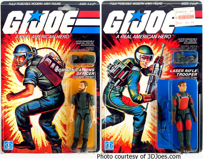
As much as I love Super Powers, I think the best example of the packaging getting kids excited for the figures is G.I. Joe: RAH. The artwork of Hector Garri was so dramatic and exciting, kids never noticed that sometimes...not always...but sometimes the figures were rather...clunky in comparison. To a kid, they were buying the character represented in that awesome artwork, and it automatically made the figure look better in their mind's eye. Those card backs sold the hell out of that toy line.Wow. You'd think they would realize how backwards that thinking is. Arguably the most popular figure cards of all time have always had the character pictured...Kenner Super Powers anyone? Hasbro has made an entire business out of nostalgia just for those cards.
Too bad. Maybe someday they'll try something different.
It's a shame many of these modern corporate licensing brand managers aren't aware, or don't care, about the history of the products they are putting their brand on.
Leave a comment:
-
I noticed during Halloween certain candy displays, which showcased DC heroes, carried the exact same artwork as the Mego heroes. Its really unfortunate that modern business models are so married to stringent guidelines they overlook the fact that uniformity to product branding is not a one-size-fits-all concept. Where a can of Coke might need to maintain the same logo, color scheme, and taste, superheroes span generations of fans and should be open to those images that are most iconic to the product/character you're selling. I mean there's as much product uniformity to a Neal Adams Batman as there is a generic picture. Its still the same character. But one will inspire kids to grab the product, while the other dulls the senses. If you're selling a KISS show do you show them standing on a multi-million dollar stage or do you show them standing in someone's back yard with kids waving sparklers? It's really unfortunate that corporate nimrods in charge of licensing can not see past the spirit of these guidelines and understand the intent is to encourage sells, not dampen them. I can certainly appreciate why Mego pushes some of the generic licensing because that allows them freedom to make the kind of packaging they want. But in terms of the original question, I think Mego is starting to find their footing and make some great character selections. Its a fun time to be in this hobby and I wish them much success.
_Superheroes_on_candy_box_display.jpg)
Leave a comment:
-
I'm the opposite, I guess, as far as card art goes. I open every package, so all of that just ends up in garbage or recycling. I do notice excellent card art (for example, FTC Swamp Thing) but card art has zero bearing on whether or not I purchase an action figure. For me, the quality/aesthetics of the figure is what determines my purchase. Not that I'm criticizing those who are all about the packaging---just putting a different perspective out there.Leave a comment:


Leave a comment: