Announcement
Collapse
No announcement yet.
Need Photoshop help on my Super Powers card design
Collapse
X
-
Sounds like you're on a better track. As long as you're shrinking from the digital photo, and not enlarging, you're going to be fine. I can give you an hand with logos, etc. I'll PM you and save the "public forum" some space. -
Also, just a little more on this. I tried to find pics of the various SP figures online to use and realized real quick that i wasn't likely going to come across anything in a Google image search that would work on the final product without looking horrible. That's why i decided to take pics of my own figures (i actually think that's kinda cooler anyway). Plus i could pose them like i wanted. My old digital camera is only 2.1 megapixels but takes very nice pics, it's a Olympus 2100UZ. So that's what i'm using for my images on the front of the trading cards. Hopefully that will be sufficient..... any feedback here? When i crop the pic out and need to resize it to fit my trading card...... is there anything special i need to do when resizing? I typically just resize it to a percentage that looks good on the card (like reduce it by xx%). I want to make sure and not mess up the resolution here either. Thanks for all the help. Everyone here has been so nice and helpful..... i tell ya what..... i think i'll just give these cards away
 .
.
Leave a comment:
-
Since i am just photochopping the Super Powers logo from a scan of an original card back, i'm sure the method mentioned above would come out much crisper. Learning Photoshop has been enough of a challenge for now, i don't think i want to take on creating the logo from scratch . Does anyone want to give this a shot for me? I wasn't happy that i couldn't get the color of the stars in the logo to match the yellow/gold i used on the rest of the card anyway.
Leave a comment:
-
Okay, now i'm hungry .
.
I appreciate all the comments and offers for help. I have PM'd with a couple of you, read your comments here, and spoke with a couple different printing companies. I think i have what i need now to put out a decent product. I have decided to redo the card this weekend at 300 dpi. I was concerned about the card turning out blurry from the very beginning. I want it to look as professional as i can. The adding water to soup example actually explains it quite well .
.
Soooo...... hopefully in the printer's hands by Monday!Leave a comment:
-
Hate to say it, but you'll want to redo them at 300 ppi from scratch or your cards won't look very good.
Starting at 72 and then just changing the resolution under image size means that Photoshop is guessing what the extra 228 pixels per inch should be. For lack of a better analogy, imagine you've made yourself a can of soup for lunch. Three of your buddies show up at your door hungry, so you add some water to the soup making one portion into four. What you end up with is four times as much soup, technically, but it doesn't taste anywhere near as good as if you started with four cans. The result is watery with just a hint of the original taste of the soup, just like adding pixels by changing the size of your image in Photoshop doesn't accurately reflect the original sharpness and quality of the original picture.
You can get away with some slight enlargement (just like you can get away with putting a little water in soup), but enlarging that much will make your image look fuzzy, the visual equivalent of watery soup.
Mmm, soup.
The reason your cards look so big in Photoshop is that your screen resolution is probably either 72 or 96 pixels per inch, so if you look at the file at 100% size, it'll be 3 or 4 times larger onscreen than the final printed product.Last edited by MegoSteve; Apr 26, '11, 5:18 PM.Leave a comment:
-
Yeah, high resolution IS the way to go. Also, you may have a problem with rescreening the dot pattern if you are scanning from a printed piece (if you print a screened image, it gets what's called a moire pattern, and it will NOT look good). I have a workaround since I'm dealing with scanning printed material on a daily basis, contact me if you need more info.Last edited by Richard J. Fowlks; Apr 26, '11, 4:27 PM.Leave a comment:
-
So what you're saying is that i'd be better off redoing it...... . I was worried about that
  .
.
As far as the logo, it is just photo-chopped off of a scan of an original Super Powers card back. I don't have near the skills to actually create the logo . The card you did is very nice, btw.
Leave a comment:
-
Yes, start at 300 dpi from the start. If you do it the other way, you run the risk of distortion. I would do the logo's etc in Illustrator so they are vector graphics. But I'm sure you'll be okay doing it all in Photoshop.
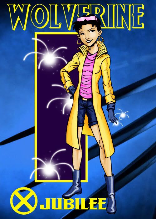
Here is a card I made several months ago, just for fun. The background was from Wolverine Origins. The rest is all me.
 Last edited by boynightwing; Apr 26, '11, 12:20 PM.
Leave a comment:
-
Thanks for all the info an offers to assist. I think i have it figured out for now... at least mostly. One thing i'm still not sure about though. I created the card in Photoshop and the default is 72 dpi. When i finished my design, and learned more about dpi and stuff, i changed the card's dpi to 300.... which made it huge on my screen. When i check the dimension of the card, it is still at 2.5" x 3.5". Am i good to go? I realize i still need to add "bleed" to my final dimension. But, did this change in dpi do anything to the resolution of the photo of Superman i used or the SP logo in the bottom corner? I just don't want those images to come out blurry after they are printed. I guess what i'm asking is if i should start at 300 dpi from the get go.
I am also looking in to another option for printing based on a recommendation from a member. So we may be waiting a touch longer than i originally hoped to roll this first card out.Leave a comment:
-
Museum/PS/AHI/FM/LM cards either run 12pt on a coated stock or occasionally on a 14pt stock with AQ coating.Leave a comment:
-
I'm also willing to help. Though it sounds like you're already in good hands.Leave a comment:
-
Holy crap! Super Powers cards?!?! That's awesome! Where does the line start?
Leave a comment:
-
My Bullmark and CIPSA cards are 130# cover, if that's any help to you.Leave a comment:


Leave a comment: