

-
Places to find PlaidStallions online: https://linktr.ee/Plaidstallions
Buy Toy-Ventures Magazine here:
http://www.plaidstallions.com/reboot/shop -
I like it - takes me back. I hope this coincides with a return to their roots. -
Hate to be a downer...but it will take a lot more than a new logo to help them out. There are just so many problems at Warner/DC you don't know where to begin. I personally think that this "Rebirth" is going to be the straw that broke the camels back. I'm going to give Wonder Woman and Superwoman a shot and see if they are any good...but the rest of what they will be offering is the same old drek. More Superman and related titles and more Batman and related titles. I don't think that's going to be able to save them...but hey, they have a new logo
BTW...I actually like the new logo."When not too many people can see we're all the same
And because of all their tears,
Their eyes can't hope to see
The beauty that surrounds them
Isn't it a pity".
- "Isn't It A Pity"
By George Harrison
My Good Buyers/Sellers/Traders list:
Good Traders List - Page 80 - Mego TalkComment
-
I like the harkening back, but it's graphically ugly. The negative spaces are unappealing. Looks like a rough draft of a logo that got passed over...then approved as was.
I think DC is realizing they are losing their old fans, and not gaining enough new ones. I applaud the return to a more traditional Superman that we're apparently getting...but they have a LONG way to go.
ChrisComment
-
^You're right, Chris. It looks like someone was trying to create an inverted image in the white.
If I didn't know better, the white in "DC" looks like it says "DH"Comment
-
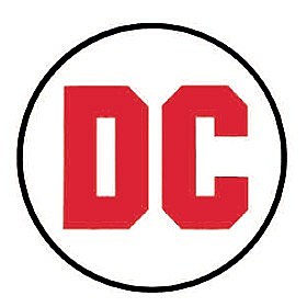
That's an odd logo to go back to as well. That logo was in use during one of the companies' most creatively bankrupt times, when sales were in the toilet, and Infantino was struggling to put out as many comics as possible to choke Marvel out. He got canned, and Jennete Kahn came in (eventually with the classic DC Bullet) and turned things around...after the DC Implosion of course, which was Mother Natures' fault, really.
ChrisComment
-
I think the stylized "C" looks more like a "G". An inverted "G"...
I'd like to see either of these return.
Comment
-
I didn't like the current logo when they announced it, and I don't think it worked on the comics and toys, but it really grew on me on TV, the way they'd use it with the "D" peeling back to reveal the character (Flash, Supergirl, Constantine, whoever) -- kinda reminded me of the Marvel corner boxes on their old covers.
The current one hits me like the Abrams-verse Enterprise, reeking of design committees and compromises that went on until everyone could agree on a design that no one was happy with. I like that the new logo is trying to hearken back (it does remind me of my early comic reading, for sure!), but I agree with E2 Chris -- along with the awful use of negative space and a funky typeface it's the wrong period to look back to. I'd say something like the late 70s/early 80s bullet that maintained the current "peel"which then tied to the character in the comic/toy packaging/movie would have gotten a more nostalgic feel and could have been really graphically striking.Comment
-
Really didn't like the "peeling" logo. Glad it's gone.
That new one is a vast improvement.
The logo they had from the late 70s onwards will always be my favourite, though.
I also liked the one they had between 2005 and 2012.

 Last edited by Bruce Banner; May 17, '16, 1:14 PM.PUNY HUMANS!
Comment
-
Maye the negative space will be transparent, and not a "blue and white logo". Something that would minimize the contrast on the cover and be less intrusive... Just a guess.Comment
-
The DC Spin wasn't a bad evolution of the Bullet. But I think they should have just stuck with the Bullet and tweaked it a bit.
ChrisComment
-
How anyone in the 40s or 50s can't adore the bullet logo, I have no idea---that "Bronze Agey" logo will always be the only one for me---though, now taking note of the bullety star in the spin one, I'd settle for that as an homage. Otherwise: Meh."No. No no no no no no. You done got me talkin' politics. I didn't wanna'. Like I said y'all, I'm just happy to be alive. I think I'll scoot over here right by this winda', let this beautiful carriage rock me to sleep, and dream about how lucky I am." - Chris MannixComment
-
"No. No no no no no no. You done got me talkin' politics. I didn't wanna'. Like I said y'all, I'm just happy to be alive. I think I'll scoot over here right by this winda', let this beautiful carriage rock me to sleep, and dream about how lucky I am." - Chris MannixComment
 Tweet
Tweet
Comment