

 Tweet
Tweet
It makes me sleepy...
-
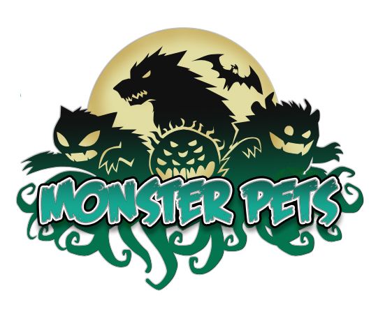
Mina is the world's first Paranormal Petsitter in the new middle-grade book series by Gary Buettner, MONSTER PETS, coming in FALL 2014 from EMBY KIDS. Spooky adventure that's perfect reading for kids 8-12
https://www.facebook.com/monsterpetsbooks?ref=hl -
I'd say it's a cold and sterile corporate logo made by corporate suits.Comment
-
You know, looking at this further, there is absolutely no joy, no energy in this logo. This is the antithesis of comic books. The article points out that it was probably designed with animation in mind, where the "D" will peel back to reveal the "C", and will run in the creddits of DC movies and TV shows. While I believe their current movie animated logo segment is far too derivative of Marvel's similar one, this is NOT the answer.
Another sign that the DC I knew and loved is completely dead and gone. It took them 40 years, but Warner Corporate has finally gutted it's carcass...
ChrisComment
-
There is nothing iconic about this new logo.Comment
-
all the great long lasting logos keep the recognizability factor even whn a change is made, like Pepsi's recent one, it still was instantly recognizable as Pepsi. This mess, if it didn't say DC under it is unrecognizable without DC comics right under it. It should really harken back to its bullet logo or stay with the current one, this is a mistake.You must try to generate happiness within yourself. If you aren't happy in one place, chances are you won't be happy anyplace. -Ernie BanksComment
-
Mediocre....the last one was fine by me. Some will never understand the concept of "it ain't broke, don't fix it.""The farther we go, the more the ultimate explanation recedes from us, and all we have left is faith."
~Vaclav HlavatyComment
-
The last one was fine. It was actually a nice update to the bullet. The letters were relatively unchanged, but the circle was replaced with the more dynamic swirl.
There have been several corporate logo misfires in the last few years. Kroger's abandoned their time-tested oval logo for some amorphous blob that was supposed to kind-of-sorta be a "K". Kraft foods redesigned their logo to look almost exactly like Yoplat's.
ChrisComment
-
Is it possible they want to build a new brand for non fantasy/superhero related stuff?Comment
-
sigpic Oh then, what's this? Big flashy lighty thing, that's what brought me here! Big flashy lighty things have got me written all over them. Not actually. But give me time. And a crayon.Comment
-
Don't get me wrong - I think it's a horrible logo either way. I'm just wondering what they might be thinking.
Like, maybe they're publishing some work that the other logo doesn't quite fit. Maybe they want a more literary logo that fits in with the other big book publishers like Random House or HarperColins?Comment
-
^^^ ZING!!!You must try to generate happiness within yourself. If you aren't happy in one place, chances are you won't be happy anyplace. -Ernie BanksComment
-
They should just go back to the original.Comment
-
That's horrendous. I always liked the 80s emblem and wasn't a fan of the swirl. But this thing makes the swirl look terrific.Comment
-
Man, they aren't even trying over there are they?
Mina is the world's first Paranormal Petsitter in the new middle-grade book series by Gary Buettner, MONSTER PETS, coming in FALL 2014 from EMBY KIDS. Spooky adventure that's perfect reading for kids 8-12
https://www.facebook.com/monsterpetsbooks?ref=hlComment


Comment