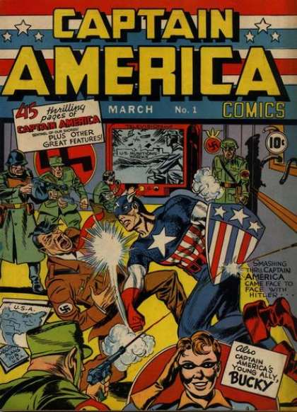
If this is your first visit, be sure to
check out the FAQ by clicking the
link above. You may have to register
before you can post: click the register link above to proceed. To start viewing messages,
select the forum that you want to visit from the selection below.
Goes to show that studios would rather photoshop something straight forward than get really creative and run with the film's idea. a 40's style movie poster would have done it! I NEED to get a print of this!
Too creative and not enough orange and blue for Hollywood.
You are a bold and courageous person, afraid of nothing. High on a hill top near your home, there stands a dilapidated old mansion. Some say the place is haunted, but you don't believe in such myths. One dark and stormy night, a light appears in the topmost window in the tower of the old house. You decide to investigate... and you never return...
Call me crazy - I love the idea - I'm not nuts about the execution, personally.
- The action in the poses is too stiff to me, Caps arms look heavy.
- The shooter looks weird to me, looks like he's aiming at the shield not Cap
- I don't like how the commandos are just standing around, kinda boring to me.
It looks like it's suppose to be a homage to Captain America #1 - but look how fluid caps motion is on the original. So much more action going on in the original cover.
- Everything looks a little crammed in, like they're fitting too many stars in
- Too many different typefaces, it makes it busy for me, good 1940s posters are really elegant with their type design.
- Some of the typefaces look more 20s and 30s then 1940s to me.
- 40s movie posters had beautiful handmade lettering, the computer lettering looks wrong for the style.
Anyway - enough fun nit-picking on here - I'm switching back to my day job of nit-picking designs!
Here's another action packed cover I really like. I like this more for the poses and the fact that it conveys so much action then the actual drawing technique:
Again, it's all personal. I just wish the poster was more exciting.
Hmmm. The original Nick Fury! Looks like they will have some sort of explanation.
There were photos of Sam jackson's Nick Fury in modern times square with Steve Rogers.
named after the ww2 Nick fury? Son or grandson of the howling commando on the far right?
Or "Nick Fury" becomes the (false) identity of whoever heads up SHIELD, like a secret identity minus the mask or akin to the the plethora of "James Bond"s in the original Casino Royale (with David Niven. Woody Allen et al)
I saw a follow up article on the internet regarding this poster. Apparently, it wasn't a rejected poster but a special commissioned commerative given to the cast and crew of the movie. Only 100 prints were made and although I'm sure a couple will come to market on Ebay; it is probably going to sell for crazy money. I wish they would release it and allow some of us collecting junkies collect it at a reasonable price.
"The farther we go, the more the ultimate explanation recedes from us, and all we have left is faith."
~Vaclav Hlavaty
Comment