

 Tweet
Tweet
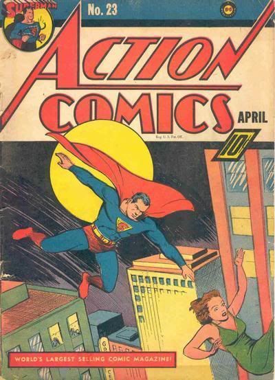
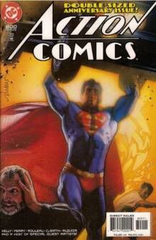
It's not something we really pay much attention to, but I was just curious if there are any particular favs. I gotta go with Action Comics. The huge, iconic letter-A in the font and it's horizontal dividing line is pure 1930's and hasn't changed a whole lot. There have been some variations, but they always come back to the original classic look. I've never seen better.


Comment