Help support the Mego Museum

Announcement

Collapse
No announcement yet.

A Tale of Two Flashes

Collapse
X
 
  • Time
  • Show
Clear All
new posts
  • Random Axe
    The Voice of Reason
    • Apr 16, 2008
    • 4518

    A Tale of Two Flashes

    I've had these guys done for a pretty lonf while and just now got around to taking pics. One turned out pretty well, one not so much.

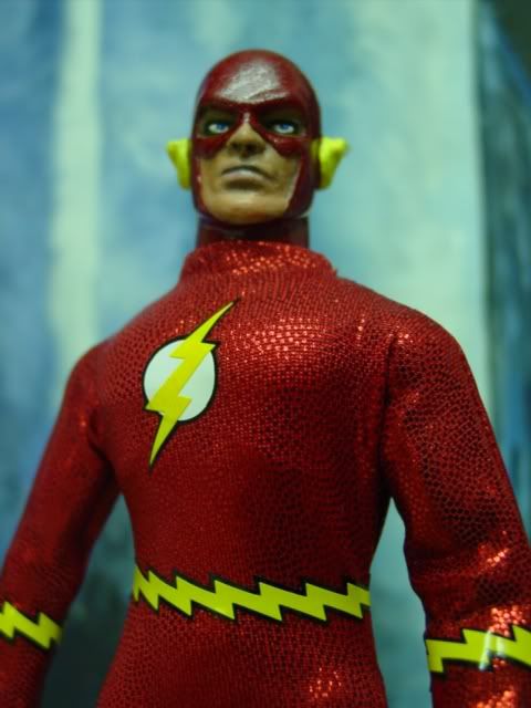
    First off, I have to give a HUGE shoutout to thatbatmanguy for creating the coolest emblems and vinyl accessories in the industry, period. These figures would completely suck without them.

    I had no idea what happened this week with head discussions, so this is ill-timed, but it is what it is. One of these has a Next2lastmohican head and the other is Juanimal. I understand there was an altercation regarding these, so I apologize in advance if these pics reopen wounds.

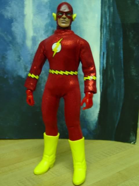
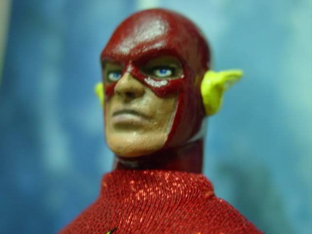
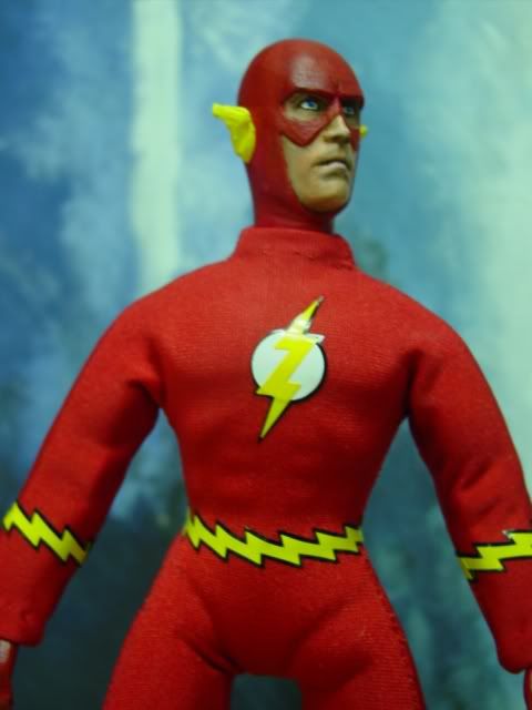
    FIrst one is a follow-up to the one I made for the Meet auction. I used Mohican's head, which is of incredible quality BTW. Terrific sculpt. I had an extra shiny suit sewn so here he is.


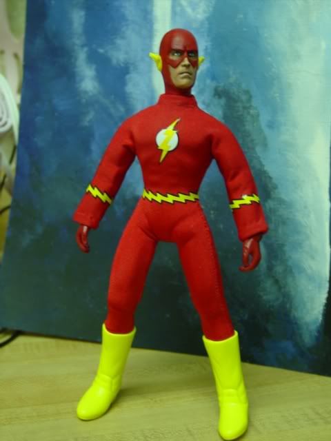
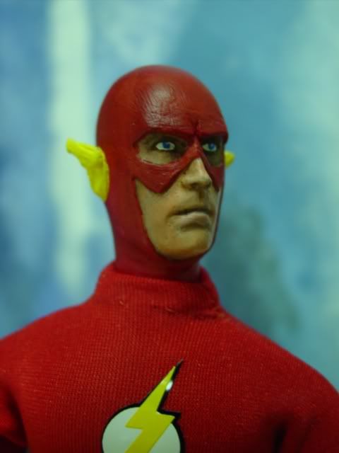
    Here's the second one that uses Juanimal's head. It has an elongated jawline, but not bad. He looks like he just pooped himself in fear, but that could be from a crappy paint job courtesy of myself.


    Last edited by Random Axe; Aug 13, '09, 5:11 PM.
    I almost had a psychic girlfriend but she dumped me before we met.

    If anyone here believes in psychokinesis, please raise my hand.
  • Megospidey
    Museum Webslinger
    • Jul 26, 2006
    • 5305

    #2
    Nice job Scott on both of them...

    yeah, what I've been told is that the bottom one is a distorted "re-cast" of the top one.

    Comment

    • toys2cool
      Ultimate Mego Warrior
      • Nov 27, 2006
      • 28605

      #3
      both look great
      "Time to nut up or shut up" -Tallahassee

      http://ultimatewarriorcollection.webs.com/
      My stuff on facebook Incompatible Browser | Facebook

      Comment

      • thunderbolt
        Hi Ernie!!!
        • Feb 15, 2004
        • 34211

        #4
        the next2lastmohican's one is a better looking Flash. most of Juanimail's ended up a bit onthe thin side.
        You must try to generate happiness within yourself. If you aren't happy in one place, chances are you won't be happy anyplace. -Ernie Banks

        Comment

        • The Bat
          Batman Fanatic
          • Jul 14, 2002
          • 13412

          #5
          Great job on both Scott!! Like the Head Sculpt on the first one best...tbolts right, the 2nd ones is kinda thin.
          sigpic

          Comment

          • goldenarm80
            New Member
            • Jan 30, 2009
            • 13

            #6
            I have to agree, while the first one has some Flashiness(LOL!) to it, the second one looks very MEGO friendly! I like them both. Nice job.

            Comment

            • BlackKnight
              The DarkSide Customizer
              • Apr 16, 2005
              • 14622

              #7
              Fantastic Figures Scott ! Those Emblems of BatBob's really make the Figure Pop ! Great Paints Bud. Who's Next ? Flash ?
              ... The Original Knight ..., Often Imitated, However Never Duplicated. The 1st Knight in Customs.


              always trading for Hot Toys Figures .

              Comment

              • QDOGG
                Persistent Member
                • Jan 13, 2007
                • 1115

                #8
                Great job. I really like the first Flash, his head and suit are killer!

                Comment

                • Meule
                  Verbose Member
                  • Nov 14, 2004
                  • 28720

                  #9
                  Both look great, but I prefer the head on the first one
                  "...The agony of my soul found vent in one loud, long and final scream of despair..." - Edgar Allan Poe

                  Comment

                  • deadpool
                    Museum Super Collector
                    • May 2, 2009
                    • 139

                    #10
                    both look great
                    Last edited by deadpool; Aug 14, '09, 6:08 AM. Reason: wrong spelling

                    Comment

                    • blastphemey
                      Persistent Member
                      • Jun 11, 2008
                      • 1114

                      #11
                      i like em bboth, looks super clean

                      Comment

                      • SlipperyLilSuckers
                        MeGoing
                        • May 14, 2003
                        • 9031

                        #12
                        I like the top one especially. Very nice Scott.

                        Comment

                        • yokaijohn
                          Keep it coolin', baby
                          • Oct 1, 2008
                          • 1439

                          #13
                          The first one wins, but they're both sweet!!
                          Monsters and much more by YokaiJohn on Etsy

                          Comment

                          Working...
                          😀
                          🥰
                          🤢
                          😎
                          😡
                          👍
                          👎