If this is your first visit, be sure to
check out the FAQ by clicking the
link above. You may have to register
before you can post: click the register link above to proceed. To start viewing messages,
select the forum that you want to visit from the selection below.
Announcement
Collapse
No announcement yet.
A movie poster for a documentary about movie posters
But the whole fun of this one is getting lost in the details - you really need to see this with all 3 feet of it sprawled out in front of you. Just as a conversation piece it would keep guys like me and you busy for hours with all the movie references crammed into this thing.
sweet jebus, I can only imagine looking at the details here.
^It's funny how subjective art is...that poster does absolutely nothing for me.
Yeah, subjective for sure!
But the whole fun of this one is getting lost in the details - you really need to see this with all 3 feet of it sprawled out in front of you. Just as a conversation piece it would keep guys like me and you busy for hours with all the movie references crammed into this thing.
This is the biggest online pic of the Tyler Stout Alamo poster I could find. Still does not do it justice. At the time my roommate had a framed version in our hallway - every time I walked by it amazed me.
Can I ask why? This genuinely surprises me, given your past as an artist doing screen printed posters for bands. The last quarter decade has seen gorgeous painted poster art being replaced with photo head shots and star-contract mandated head sizes and placement, I would have thought you'd be all on board folks coming up with an alternative to that. Particularly given how artful, well designed and imaginative they can be in the hands of the right artist.
Oh boy --- I think this is going to be hard to explain in a post.
Part of my reaction to this trend is because of how closely I was following the last peak and valley of gig poster art — which I'd say lasted from around 2000 - 2010 (I'm bad with dates, but this seems about right). There were so many wonderful and uniquely talented artist/designer who were passionate about music and incredible things happen when they create posters for bands they love, but you also get TONS of artists who are not as talented who are using the trend to try and get noticed. It's far easier to create artwork people want to buy from you if your artwork also has the name of the band people love on it. You get a built in audience, if you see what I mean.
As a designer the thing that feels wrong is that the design intention of a gig poster should be to get people to come to a show, it's advertising, but as the posters got fancier, more exclusive and collectible they were used less and less as advertising and more and more as band merchandise ——— on good days. On bad days, the bands were not even involved or informed about the poster designs and the work was just a way for people to try to make a few bucks off a hard working touring band — essentially black market merch. It was a bit parasitic. There was a lot of crappy work flooding the market and crappy artists trying to make a few bucks. Even some of the good work was starting to feel stale because they weren't ads for shows anymore - they were becoming pieces of art with band names on them.
During all this I saw the offshoot birth and growth of this movie poster trend we're still seeing. It sort of started with Criterion Collection commissioning some of the more talented gig poster and comic artists to create new cover artwork for them. I'm a purist, and 99% of the time what I want to see on a DVD I purchase is the original poster art, but Criterion had such a great team working for them that I LOVED almost everything they did.
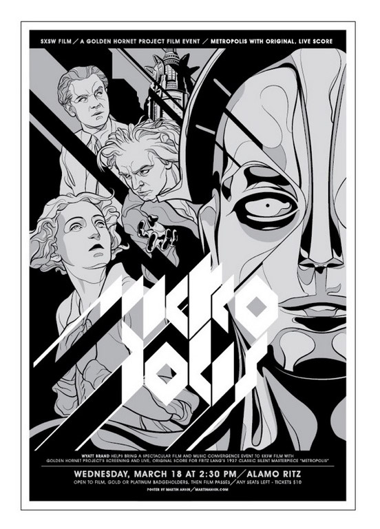
Around then I noticed some of the bigger rep theatres, like The Alamo in Austin, Texas, started commissioning artists to create posters for specific movies or events. (Tyler Stout's Alamo poster is still one of my favorite posters ever. Pics online do not do it justice —*you and everyone on the Mego Museum would LOVE to see this poster in real life — if you haven't already.)
I think this idea of re-imagining classic movie art got a lot of want-to-be designers creating new art for classic movies and selling them on places like etsy — essentially using the popularity of movies to create unlicensed black market movie merch to try and cash in.
Some were interesting and creative - and like, 99 percent of the stuff I saw (and still see) is a bad Saul Bass ripoff with like, one small detail of the movie that fans would recognize — like Luke's hand chopped off for Empire Strikes Back.
But, the bottom line is that even the really good pieces don't feel right to me. I LOVE movie poster art. There's something about summing up the flavour of a movie and figuring out a way to try and grab people to come see a movie that I absolutely love — and these new posters don't do that. The design intention is different —*they're movie merch designed for built-in fans of the movie. They can be clever, and really nicely designed — but I'd argue that they're WAY WAY WAY less challenging to create, from a design perspective.
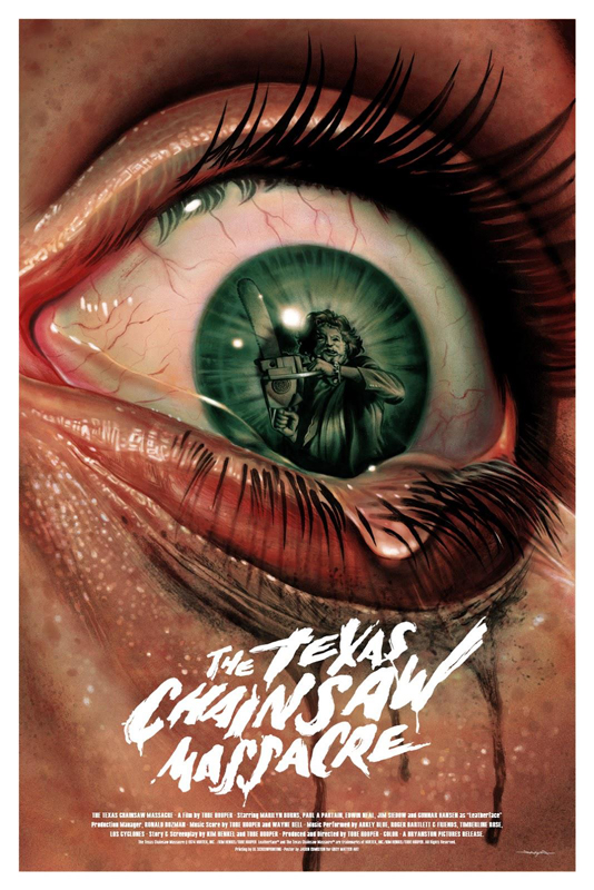
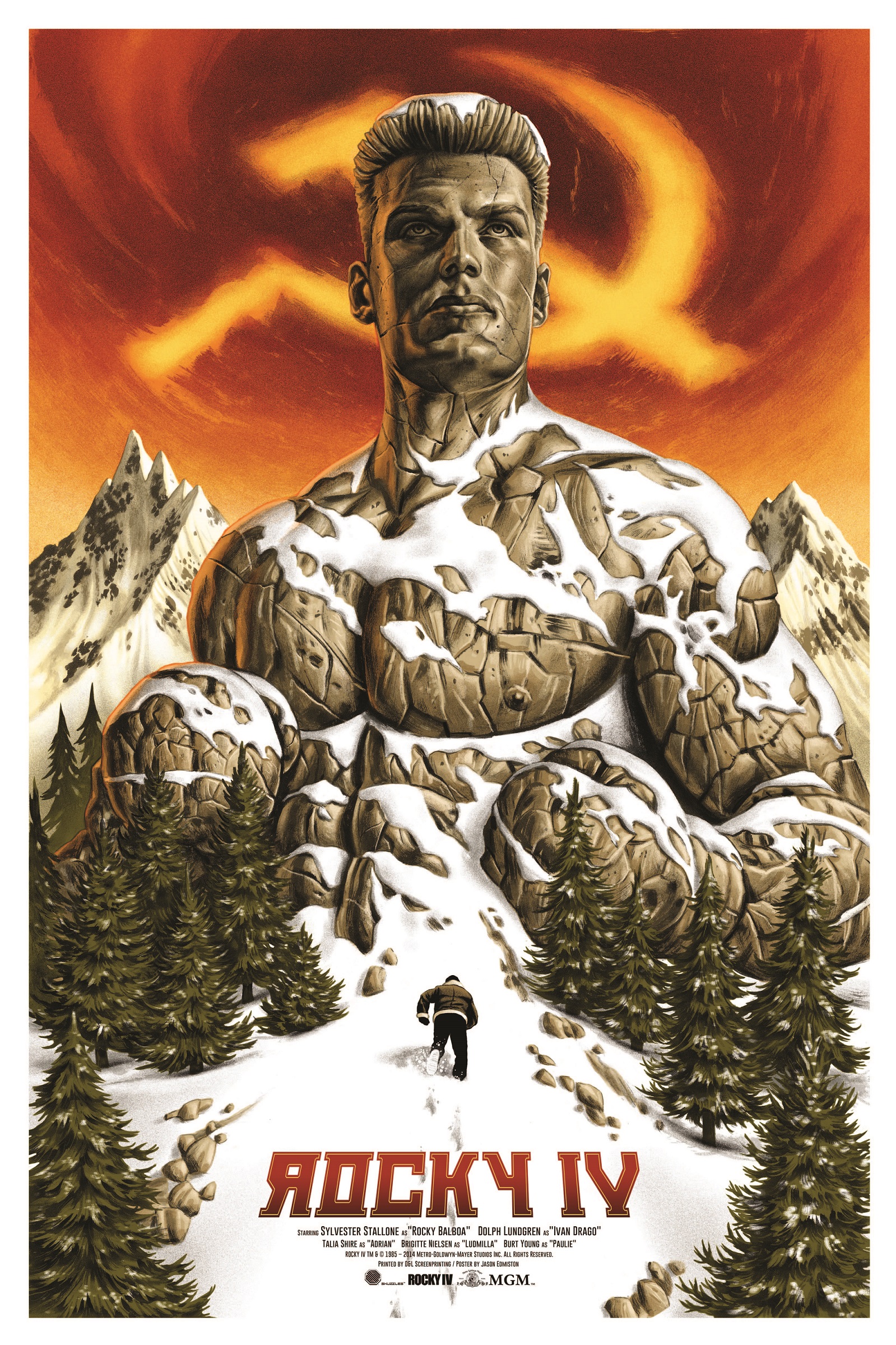
Those two posters you linked - they're both really nice pieces - the Texas Chainsaw one is a passible horror genre movie poster (I still think the original is much more brutal and effective), but I'd argue the Rocky 4 one would never be used as an advertisement. It's very clever, and well rendered, but it doesn't suit the tone of the series, the star is too small and facing away from the viewer, and it only makes sense to people who have seen the movie.
Don't get me wrong, I'm in 100% agreement with you about current movie posters - and I would LOVE LOVE LOVE to see NEW movies bring back painting and illustration. But, to me this is fan art. It's fine, but not as exciting to me.
Director Kevin Burke on one-sheets and screenprints
Kevin Burke remembers the print that led him to make 24x36: A Movie About Movie Posters. "It was There Will be Blood by Olly Moss. I'd never seen a screenprint movie poster before, and I immediately fell in love with it. It had been years since I had cared about a film poster that much."
The print was a gift from his fiancée, and took Burke back to his childhood habit of asking his local cinema if he could have the lobby posters after a film had finished its run. He said, "They would call you, or call your mom, and tell you, 'Hey, Kevin can have this poster,' and I'd get on my bike and go get it. when I got this screenprint, that feeling came back."
For decades, the poster was the first image audiences would see of a film. Burke said, "Like many other filmmakers, I used to spend a lot of time in video stores and movie theatres, and the art was everywhere. They used to make these promises of grand excitement and adventure, and you could make your decisions about what this story was about, and whether this film could deliver on it."
I'm not crazy about the somewhat recent trend of artists doing modern art print redesigns for posters.
Can I ask why? This genuinely surprises me, given your past as an artist doing screen printed posters for bands. The last quarter decade has seen gorgeous painted poster art being replaced with photo head shots and star-contract mandated head sizes and placement, I would have thought you'd be all on board folks coming up with an alternative to that. Particularly given how artful, well designed and imaginative they can be in the hands of the right artist.
The very first thing I thought when I saw the video link was the first 36 was hard to find...
Then I realized it was poster size and not chick measurements. The confusion was the incorrect poster measurements.
24 x 36 seems to refer to the size of many of the screen printed art print posters typical of this modern fan poster movement, which is what this documentary is actually about. All in loving homage to the painted movie posters of yesteryear.
“The Texas Chainsaw Massacre.” This edition created by Jason Edmiston, is a 24″ x 36″ 10-color Screenprint, available in Regular (Ed of 200, $50) and Variant (Ed of 125, $65) editions.
Skuzzles is on a roll with their latest movie poster for “Rocky IV” created by Jason Edmiston. It is a 24″ x 36″ 9-color Screenprint, available in Regular (Ed of 150, $50) and Variant (Ed of 75, $60).
I'm not crazy about the somewhat recent trend of artists doing modern art print redesigns for posters, and that seems to be a focus of this from the trailer, but it's got interviews with a couple of classic poster artists, so I'll probably check it out at some point.
First thing I thought of! That reminds me, because 27x40 is the current size, it is easy to find cheap frames that size, but I have an older 27x41 poster that I can't find a reasonably priced frame for (let's say around 20 bucks), any ideas anyone?
If your poster isn't worth all that much and you're using it mostly for decoration just fold the white edges on the top and bottom enough to squeeze it into a 27x40 frame.
Wow. I hate to tell these folks but the standard movie poster size is 27x41...modern are 27x40.
First thing I thought of! That reminds me, because 27x40 is the current size, it is easy to find cheap frames that size, but I have an older 27x41 poster that I can't find a reasonably priced frame for (let's say around 20 bucks), any ideas anyone?


Leave a comment: