
 Tweet
Tweet
Ok, I may be taking this WAY too seriously, but I just love the Super Powers line and since you were asking for opinions...  .
.
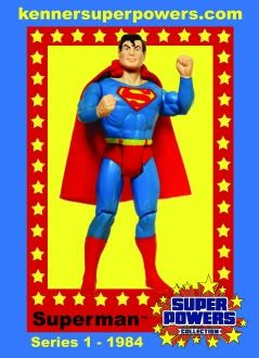
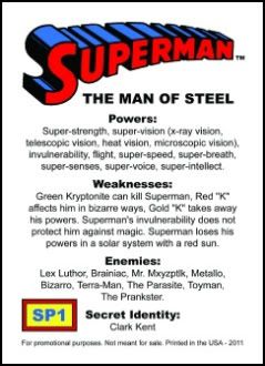
I downloaded your three card designs and opened all three at the same time so that I could compare them. Then I got out my carded Super Powers figures to look at the color blue on the cards. I realize that each person's monitor is set up differently, so I'm looking at the color blue of the card in relation to the Superman figures on the cards.
My brightest, series one Super Powers cards (and my duel language, wide Canadian cards) actually come pretty darn close to matching the blue of Superman's costume - much like your FIRST card designs. My narrow, Canadian gas station promotion Super Powers cards (and some of my cards that have faded a bit) have more yellow in the blue - much as your LAST card design (the one without the Superman figure pictured on the card). So it seems to me that you might be matching the blue of the narrow, Canadian cards (or a faded American card) rather than the original series one cards.
As for the series info at the bottom, I like the design of the yellow bubble with black text, but the yellow text without the bubble is easier to read. That might not be the case once the cards are printed, but on my monitor the yellow text without the bubble is easier to read.
P.S. Can you tell that I'm excited about these cards coming out?!?!?!
. I downloaded your three card designs and opened all three at the same time so that I could compare them. Then I got out my carded Super Powers figures to look at the color blue on the cards. I realize that each person's monitor is set up differently, so I'm looking at the color blue of the card in relation to the Superman figures on the cards.
My brightest, series one Super Powers cards (and my duel language, wide Canadian cards) actually come pretty darn close to matching the blue of Superman's costume - much like your FIRST card designs. My narrow, Canadian gas station promotion Super Powers cards (and some of my cards that have faded a bit) have more yellow in the blue - much as your LAST card design (the one without the Superman figure pictured on the card). So it seems to me that you might be matching the blue of the narrow, Canadian cards (or a faded American card) rather than the original series one cards.
As for the series info at the bottom, I like the design of the yellow bubble with black text, but the yellow text without the bubble is easier to read. That might not be the case once the cards are printed, but on my monitor the yellow text without the bubble is easier to read.
P.S. Can you tell that I'm excited about these cards coming out?!?!?!
 .
. . I am going over to her house again today to have her husband re-take the pics for me.
 . You can view this bad boy at almost 1600% and it still doesn't look very grainy.... just a little on the image of Superman. Forget mini-posters...... anyone want a real poster of it
  .
. .
.
 . Going to give it a final "once over" tonight and then it's off to the printer.
 .
.

 .
.
Comment