
 Tweet
Tweet
Wow, so much good info here.... i really appreciate everyone's input! I have another question. The printer instructs that all images be provided in CMYK mode. Not sure exactly what this means or why they want it that way. I only know it has something to do with colors. I found where to make my card CMYK when i first create a new file in Photoshop. If i click there to set it at that, am i through worrying about it at that point? Do the images i paste into my project have to be CMYK too or are they okay since i created my card in CMYK mode from the beginning?
-
Vintage Toy Rescue
1614-B N State Hwy 161
Grand Prairie, TX 75050
(972) 740-4424
www.vintagetoyrescue.com -
If you start the file new and choose CMYK, you are set. Any objects you paste into that file will automatically be converted to CMYK. If you work on an existing file, you convert to CMYK via the Image menu. The very first selection there should be mode and it will present you with a sub-menu to choose files color mode.
However, you might want to create your file as RGB and work on it in that color mode. I do that and then make a copy of it to convert to CMYK for the printer when I am finished. The RGB color gamut is quite a bit larger than CMYK and will usually print nicer to an inkjet printer. You lose the punch of the deep reds and blues in CMYK mode. Cyan, Magenta and Yellow are weak colors and don't print as vibrant, especially on an inkjet printer.Comment
-
super power cards
Hi FM Bill ,
I've sent you a PM
KevinComment
-
Thanks for the font! I just downloaded and installed it. It is really close!!Comment
-
It still needs some tweaking but a thunder storm is heading back this way...
Comment
-
It sounds like you're covered on any help that you might need with these cards, but if there are still questions, let me know. I was involved with a set of cards in 2009 and had a lot of the same concerns about quality that you have (a lot of the details were new to us as well). Much like you're doing with trying to emulate the figure packaging on the Super Powers cards, we were trying to emulate elements from Star Wars figure cards and KISS trading cards while giving the cards an overall 1970s look even though we were using photos that were taken recently. Even though we didn't know what we were doing when we started, we ended up very happy with the final product, so if you get stuck, feel free to give me a shout. Nostalgia just ain’t what it used to be.
Comment
-
Vintage Toy Rescue
1614-B N State Hwy 161
Grand Prairie, TX 75050
(972) 740-4424
www.vintagetoyrescue.comComment
-
I sent Rich a couple of the logo files i am working with and he said one of them is going to work out great. I will even be able to do a mini poster at some point . He cleaned it all up and sent it back to me already. I can't wait to get home this evening and download it. A big thanks for the assist Rich !
I really appreciate everyone who has taken an interest in this project. The offers to help and the advice given in this thread is just over the top. Kudos to you all. I will never be able to remember everyone that has helped out in order to properly give credit where due, so i wanted to just thank you all here and now. This is the Museum at it's best and why everyone keeps coming back.
 Vintage Toy Rescue
1614-B N State Hwy 161
Grand Prairie, TX 75050
(972) 740-4424
www.vintagetoyrescue.comComment
-
Getting close on the reboot . This one is at 600 dpi.
 Last edited by Fire Marshal Bill; Apr 30, '11, 1:49 AM.Vintage Toy Rescue
1614-B N State Hwy 161
Grand Prairie, TX 75050
(972) 740-4424
www.vintagetoyrescue.comComment
-
Lookin' great!!Comment
-
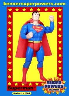
Thanks Rich! The logo came out awesome . I re-shot the pics of Superman this evening with my step daughter's Nikon DSLR. She is going to drop the disc off tomorrow.
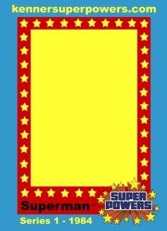
I'm struggling with the Series 1 - 1984 part of the card right now. I can't decide if i like it or not. I played around with different designs and finally decided this balances out the best. Even though now it looks like it is missing something on the sides of the card. I just don't want to confuse folks by making them think that that series number or date has anything to do with when the trading card set was produced. But i do want to include somewhere that the actual figure represented on the card was introduced in Series x - 198x. Any thoughts? Or leave well enough alone?
Also, i don't know if i like the background blue color as much as i did the first one. But it does represent the color of the original Super Powers card back better though. I think i'll leave it like this.Last edited by Fire Marshal Bill; Apr 30, '11, 2:38 AM.Vintage Toy Rescue
1614-B N State Hwy 161
Grand Prairie, TX 75050
(972) 740-4424
www.vintagetoyrescue.comComment
-
I like the way that the red bar behind the figure name (in this case - "Superman") now goes all the way across the bottom. I also think the series number and date look fine and provide good information. I agree with you about the blue; I prefer the blue you had on the first card, but it makes more sense to use the blue that best matches the card back. These cards are going to be great! I can’t wait until they’re here!Nostalgia just ain’t what it used to be.Comment
-
Here was an in between design pic from earlier that i haven't posted yet. It shows a different idea with the Series # - Year information. How do ya'll think this would look? Keeping in mind the overall design and colors have changed somewhat. Just basically talking about the yellow rounded rectangle with the text in black part of the card.
 Vintage Toy Rescue
1614-B N State Hwy 161
Grand Prairie, TX 75050
(972) 740-4424
www.vintagetoyrescue.comComment
-
Looks really sharp Bill - nice job!Comment

Comment