
 Tweet
Tweet
I felt the recent Mummy card design had much room for improvement.
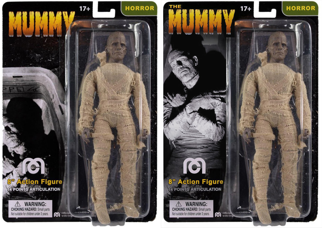
The image is oddly placed on the card...there is too much dead space between the logo and image, not to mention its THE Mummy, not "Mummy".
I used the same approved images, just slightly rearranged to better balance the card design and increase it's visual appeal. Before and after...
The image is oddly placed on the card...there is too much dead space between the logo and image, not to mention its THE Mummy, not "Mummy".
I used the same approved images, just slightly rearranged to better balance the card design and increase it's visual appeal. Before and after...


Comment