Help support the Mego Museum

Announcement

Collapse
No announcement yet.

Why were Charlton covers so washed out?

Collapse
X
 
  • Time
  • Show
Clear All
new posts
  • YoungOnce
    Career Member
    • Aug 29, 2007
    • 966

    Why were Charlton covers so washed out?

    I haven't been able to find anything that addresses this specifically.

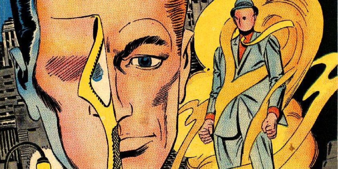
    Is it just me or did all the Charlton Comics back in the day seem to have washed out covers. That was always a bit of a turn-off for me, even though all those cool Ditko covers were well drawn. It just seemed like the color palette was muted or something compared to Marvel and DC.

    Did it have something to do with the quality of the paper they were using. Was it different from Marvel and DC?
  • Brazoo
    Permanent Member
    • Feb 14, 2009
    • 4767

    #2
    That makes sense, and it's what I assumed, but since I can't sleep I just pulled out a few late 70s early 80s Charlton books I had nearby and I'm directly comparing them to Marvel and DC comics from the same era — the covers look look less glossy and the paper seems about the same weight (thickness) but less smooth on all of these examples.

    The interiors are worse. Much much worse than the Marvel and DC books. Ink coverage is noticeably off and the paper seems thinner.

    Comment

    • Brazoo
      Permanent Member
      • Feb 14, 2009
      • 4767

      #3
      The colour pallets are generally a bit weirder and duller on these too. Marvel and DC covers seem to just have bolder and more eye-catching designs and art direction overall.

      Comment

      • RonnyG
        Career Member
        • Apr 23, 2014
        • 909

        #4
        I watched a documentary on Charlton comics about two years ago because I had purchased a bunch of their old cheesy romance comics at an antique mall, and I wanted to learn more about the company. According to the documentary, the founders were two ex-cons who met in prison. They were cheap and didn't care about their product. They just wanted to make a profit. They used lower quality paper, and they owned their own printing press that was once used to print cereal boxes.

        The following quote is from https://comicvine.gamespot.com/charlton/4010-125/

        "Charlton was a unique company in that unlike larger publishing concerns, Charlton's entire production process for its comic books (as well as its other published output) was entirely produced under its own auspices; every phase of production, from Editorial art creation to Printing to Distribution, came directly from the company's editorial headquarters/printing plant in Derby Connecticut. (in fact, that alone would make Charlton unique as a publisher. Photos exist of the offices of "Charlton Publications" which feature a massive building -- the printing plant--looking more like the factory it in fact was than a publishing concern)

        While in one way this unique organizational structure gave the company singular control of its product, it also meant that if the company didn't particularly care about the quality of its output, it had to answer to no one (except of course it readers. More on that in a moment). Since the comic-book line was essentially created as a way to keep the company's massive printing facility up and running overnights, (since shutting down the gigantic industrial printers for the night and then starting them up again in the morning would be prohibitively expensive) they were decidedly less critical about the quality exhibited in their comics. Charlton was notorious for the low quality control they exerted over the comics they produced--the quality of their comic-book paper was often a much cheaper grade than higher-end publishers, there was less oversight of the registration of printing plates, so no matter the quality of the artwork, patches of color often floated far and wide from the lines that were meant to border them, and of course because they paid so little, their artists were often less careful about the quality of their artwork or so overworked (adding page count as a way to fill up a decent paycheck) that their books' artwork suffered in comparison to other publishers--- as well as for the extremely low page rates they paid to their artists and writers."


        Here's the trailer to "Charlton Comics: The Movie"
        Last edited by RonnyG; Apr 17, '19, 9:22 AM.

        Comment

        • RonnyG
          Career Member
          • Apr 23, 2014
          • 909

          #5
          And if you have even more time, this docu goes into more detail...

          Comment

          • hedrap
            Permanent Member
            • Feb 10, 2009
            • 4825

            #6
            Thanks Ronny! That's awesome!

            I've always wondered what the point of this company was. The decisions were so haphazard, it didn't feel like they were in it for the character licensing.

            Comment

            • palitoy
              live. laugh. lisa needs braces
              • Jun 16, 2001
              • 59229

              #7
              My main exposure to Charlton as a kid were those bags of "Modern Comics" reprints that hung in every Bi-Way and Bargain Harolds for decades. The one thing that always seemed strange to me as a kid was the lettering, it was so...bland.

              While I liked the art and some of the stories in those books they felt like knock off Koolaid as a kid, you could tell it wasn't name brand.
              Places to find PlaidStallions online: https://linktr.ee/Plaidstallions

              Buy Toy-Ventures Magazine here:
              http://www.plaidstallions.com/reboot/shop

              Comment

              • YoungOnce
                Career Member
                • Aug 29, 2007
                • 966

                #8
                Thanks guys for the wealth of information. All of that kind of makes you wonder why Ditko wanted to work for them. I'd read that their artist rates were much lower too. The trade off was that the creators could pretty much do whatever they wanted to do, but if the trade-off is that the finished product looked inferior... I don't know.

                Comment

                • Earth 2 Chris
                  Verbose Member
                  • Mar 7, 2004
                  • 32525

                  #9
                  My main exposure to Charlton as a kid were those bags of "Modern Comics" reprints that hung in every Bi-Way and Bargain Harolds for decades. The one thing that always seemed strange to me as a kid was the lettering, it was so...bland.

                  While I liked the art and some of the stories in those books they felt like knock off Koolaid as a kid, you could tell it wasn't name brand.
                  I got some of those "Modern Comics" AFTER DC bought the Charlton characters, right as they were starting to push them. My understanding is the lettering (credited to "A. Machine") was done by putting the actual comic art pages into a large type writer. So they rolled up original Steve Ditko art like that!

                  I did have a few other Charlton books from the 80s, and they definitely seemed...cheap. Their history is fascinating.

                  Chris
                  sigpic

                  Comment

                  • palitoy
                    live. laugh. lisa needs braces
                    • Jun 16, 2001
                    • 59229

                    #10
                    Originally posted by Earth 2 Chris
                    I got some of those "Modern Comics" AFTER DC bought the Charlton characters, right as they were starting to push them. My understanding is the lettering (credited to "A. Machine") was done by putting the actual comic art pages into a large type writer. So they rolled up original Steve Ditko art like that!
                    I always thought it looked like that, it made you appreciate other comics.
                    Places to find PlaidStallions online: https://linktr.ee/Plaidstallions

                    Buy Toy-Ventures Magazine here:
                    http://www.plaidstallions.com/reboot/shop

                    Comment

                    • YoungOnce
                      Career Member
                      • Aug 29, 2007
                      • 966

                      #11
                      Originally posted by Earth 2 Chris
                      My understanding is the lettering (credited to "A. Machine") was done by putting the actual comic art pages into a large type writer. So they rolled up original Steve Ditko art like that!
                      Chris
                      Yikes.

                      Comment

                      • Brazoo
                        Permanent Member
                        • Feb 14, 2009
                        • 4767

                        #12
                        Originally posted by YoungOnce
                        Thanks guys for the wealth of information. All of that kind of makes you wonder why Ditko wanted to work for them. I'd read that their artist rates were much lower too. The trade off was that the creators could pretty much do whatever they wanted to do, but if the trade-off is that the finished product looked inferior... I don't know.
                        Yeah, I'm not super knowledgable about Ditko's career, but from what I understood Ditko wanted more creative freedom but I assume it was also just needed work because I think he created work for Charlton and Marvel at the same time.

                        I found this which goes into more detail:
                        Throughout most of his career in comics, Steve Ditko was connected with the small comic book publisher, Charlton Comics, where he invented many heroes

                        Comment

                        • cjefferys
                          Duke of Gloat
                          • Apr 23, 2006
                          • 10180

                          #13
                          Originally posted by palitoy
                          While I liked the art and some of the stories in those books they felt like knock off Koolaid as a kid, you could tell it wasn't name brand.
                          Charlton, the "Freshie" of comic books.


                          I remember those bags of comics too, they were my main exposure as well.

                          Comment

                          • EmergencyIan
                            Museum Paramedic
                            • Aug 31, 2005
                            • 5470

                            #14
                            Charlton produced the “Emergency!” comics and magazines. The comics aren’t great and there were only four produced. However, the four magazines are much nicer and have great cover art. Neal Adams did one of the magazine covers and interiors. I believe he also did one of the other of the four magazines. This would have been 1976.

                            - Ian
                            Rampart, this is Squad 51. How do you read?

                            Comment

                            • Earth 2 Chris
                              Verbose Member
                              • Mar 7, 2004
                              • 32525

                              #15
                              ^Yeah, I believe Charlton farmed out a lot of (if not all) of the content of their magazines to Adams' Continuity Studios. So they look great.

                              Chris
                              sigpic

                              Comment

                              Working...
                              😀
                              🥰
                              🤢
                              😎
                              😡
                              👍
                              👎